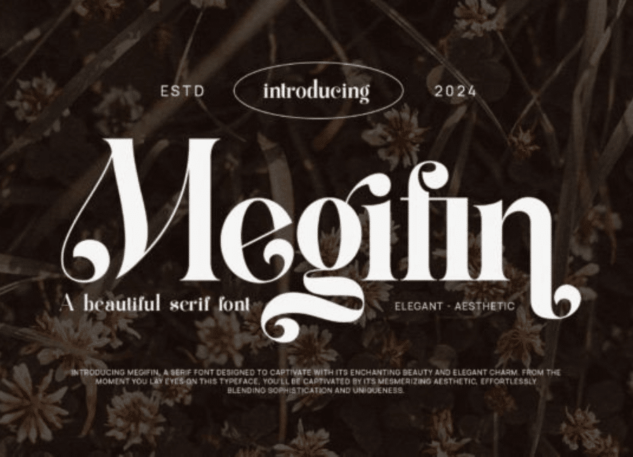
Megifin Font: A Modern Serif Crafted for Timeless Elegance
In the world of typography, a well-designed serif font has the power to communicate tradition, elegance, and authority—all while maintaining a modern appeal that suits contemporary design needs. The Megifin font stands out as a prime example of this balance. It blends the sophistication of classic serif structures with a fresh, refined sensibility, making it a popular choice for branding, editorial design, luxury packaging, and digital content. With its graceful curves, high-contrast strokes, and carefully sculpted letterforms, Megifin delivers an aesthetic that is both stylish and highly functional.
A Distinctive Aesthetic Identity
Megifin is designed with a strong sense of personality. Many serif fonts prioritize neutrality, but Megifin embraces artistic character without compromising readability. Its elongated serifs, elegant terminals, and smooth transitions between strokes give the typeface a unique visual rhythm. Each letterform feels thoughtfully crafted, contributing to a cohesive design that is perfect for display use. When featured in magazine titles, brand logos, headline layouts, or hero sections on websites, Megifin instantly elevates the visual tone with sophistication.
The font’s high contrast between thick and thin strokes adds a dramatic flair that draws attention without overwhelming the composition. This balance of subtlety and boldness allows Megifin to function exceptionally well in high-impact design contexts. It delivers presence while maintaining a refined elegance that appeals to both traditional and modern design sensibilities.
Exceptional Readability and Practicality
Beyond its beauty, Megifin is praised for its usability. Not all decorative serif fonts maintain readability across various sizes, but Megifin manages to strike a rare equilibrium. Its proportions are precisely engineered to provide clarity even in smaller text applications. This makes it suitable not only for headlines but also for subheadings, editorial content, and certain types of body text.
The letter spacing, stroke weight distribution, and x-height are all optimized to ensure legibility on both print and digital platforms. Whether viewed on high-resolution screens, mobile devices, or printed materials, Megifin retains its crisp structure and visual coherence. This combination of practical functionality and refined artistry is a key reason the font has gained popularity among designers.
Versatility Through Stylistic Features
One of Megifin’s greatest strengths lies in its versatility. Many releases of the font include stylistic alternates, ligatures, and decorative swashes that allow designers to bring additional personality to their work. These features expand the creative possibilities significantly.
For branding projects, the alternate characters can help create unique logotypes with a distinctive flair. Wedding invitations, luxury product packaging, upscale menus, and editorial spreads benefit greatly from the ornamental touches the font offers. Designers can easily switch between the standard, more conservative characters and the expressive alternates depending on the mood and message they want to convey.
This range of stylistic expression ensures that Megifin can adapt to a wide variety of visual themes—minimalist, classic, artistic, modern, or luxurious. It seamlessly integrates into different design contexts without losing its core identity.
Ideal for Luxury and Creative Industries
Serif fonts have long been associated with heritage, prestige, and sophistication—qualities extremely valuable in the luxury industry. Megifin embodies these attributes while still feeling contemporary and fresh. This makes it an excellent choice for high-end branding, fashion editorials, jewelry packaging, boutique labels, and premium print materials.
Creative agencies and lifestyle magazines also favor Megifin font for its ability to craft visually engaging layouts. Its high-contrast forms and graceful detailing allow designers to produce compelling typographic hierarchies that lead the reader’s eye across the page with ease. Even in digital environments, Megifin maintains a strong visual presence, particularly in hero sections, portfolio displays, and product feature pages.
Small businesses and independent creators appreciate Megifin for its ability to instantly professionalize their visual identity. A simple logo, flyer, or social media graphic can look far more polished and high-quality when styled with this typeface.
Enhancing Visual Storytelling
In today’s visual-first design landscape, typography is one of the strongest tools for storytelling. Megifin contributes significantly to this by adding emotional depth and visual richness to any composition. Its expressive curves and refined structure help set the tone, whether the message aims to feel romantic, luxurious, editorial, or artistic.
Because Megifin is both timeless and modern, it works well in long-term branding applications. Design trends may shift, but Megifin’s classic foundations ensure that it remains relevant year after year. This longevity is especially valuable in brand identity work, where consistency and lasting appeal are essential.
Conclusion
Megifin font is more than a stylish serif typeface—it is a versatile design tool that combines aesthetic sophistication with everyday practicality. Its refined form, distinctive personality, and wide range of stylistic features make it suitable for countless creative applications. Whether you are designing a luxury brand, building a high-end magazine layout, or crafting visually striking digital content, Megifin has the elegance, clarity, and artistic charm to elevate your work. It is a font that not only enhances readability and visual appeal but also delivers lasting impact in any design environment.