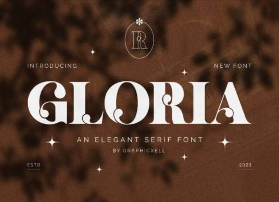
Gloria Font: A Stylish Typeface That Balances Elegance and Personality
Typography plays a critical role in visual communication, shaping how messages are perceived before a single word is read. Among the many typefaces available to designers today, Gloria Font stands out as a refined yet expressive choice that blends elegance with character. Designed to be visually engaging and versatile, Gloria Font offers a unique balance between sophistication and warmth, making it suitable for a wide range of creative applications.
Whether used for branding, editorial layouts, packaging, or digital designs, Gloria Font delivers a polished appearance that enhances visual storytelling. This article explores the defining features of Gloria Font, its design personality, practical use cases, and why it continues to attract designers looking for a distinctive typographic voice.
The Design Personality of Gloria Font
Gloria Font is characterized by its graceful letterforms and smooth curves, which give it a refined and approachable appearance. It often falls into the script or modern display typeface category, depending on the specific version, and is designed to convey emotion, charm, and clarity. The strokes feel intentional and balanced, with thoughtful spacing that ensures readability while preserving a decorative flair.
One of Gloria Font’s most appealing qualities is its ability to feel both classic and contemporary. The font does not rely on excessive ornamentation; instead, it uses subtle stylistic details to create elegance without overwhelming the viewer. This makes it suitable for modern design projects that still aim to evoke a sense of tradition or sophistication.
Visual Characteristics and Letterform Details
The letterforms are typically smooth and flowing, with rounded terminals and consistent stroke weight. This creates a harmonious rhythm across words and lines of text. Uppercase characters often feel bold and expressive, while lowercase letters maintain a softer, more conversational tone.
Kerning and spacing are carefully crafted to ensure that the font looks polished in both short headlines and longer text segments. Many designers appreciate it for its clean baseline alignment, balanced ascenders and descenders, and overall legibility, even at smaller sizes.
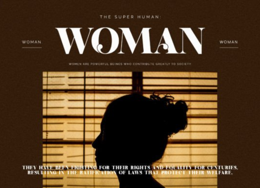
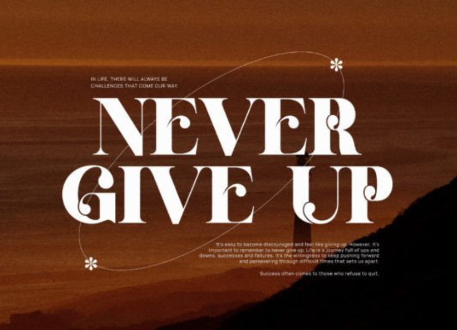
These characteristics make it particularly effective for logos, headings, and brand names where visual impact is essential.
Versatility Across Design Projects
One of the strongest advantages of Gloria Font is its versatility. It adapts easily to various design contexts, allowing creatives to use it across both print and digital platforms.
Branding and Logo Design Gloria Font is an excellent choice for brands that want to communicate elegance, creativity, or femininity. It works especially well for fashion labels, beauty brands, lifestyle businesses, boutiques, and personal brands. The font’s expressive nature helps logos feel unique and memorable without sacrificing professionalism.
Editorial and Print Design In magazines, brochures, and invitations, it adds a touch of sophistication and personality. Designers often use it for headlines, pull quotes, or section titles to create visual contrast with simpler body fonts. Its refined style enhances storytelling and adds visual interest to editorial layouts.
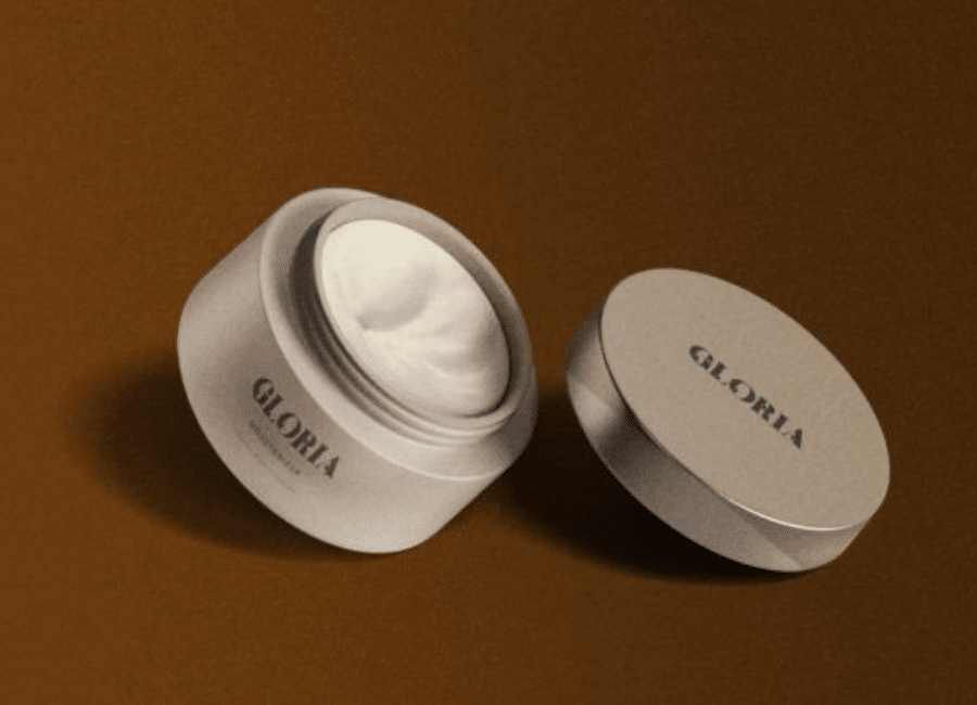
Packaging Design Packaging often relies on typography to convey quality and identity. The shine on product labels, cosmetic packaging, candle boxes, and luxury goods. When paired with minimal graphics or neutral color palettes, it elevates the overall presentation and reinforces a premium feel.
Social Media and Digital Content For digital creatives, Gloria Font is ideal for Instagram posts, Pinterest graphics, website headers, and promotional banners. Its stylish appearance helps content stand out in crowded feeds while remaining readable on screens.
To maximize its impact, Gloria Font is best paired with clean and simple fonts. Because it has strong personality, combining it with neutral sans-serif or classic serif fonts creates balance and hierarchy.
For example, using Gloria Font for headings or brand names and pairing it with fonts like Montserrat, Open Sans, or Lora for body text ensures clarity while maintaining visual interest. This combination allows Gloria Font to shine as a focal point without overwhelming the overall design.
Emotional Impact and Brand Messaging
Fonts carry emotion, and Gloria Font is particularly effective at conveying warmth, elegance, and creativity. It feels welcoming and expressive, making it suitable for brands that want to build emotional connections with their audience.
Unlike rigid or overly formal typefaces, Gloria Font feels human and artistic. This makes it an excellent choice for storytelling, personal branding, and creative industries where authenticity and individuality matter.
Readability and Practical Use
Despite its decorative qualities, Gloria Font maintains good readability when used appropriately. It performs best at medium to large sizes, such as headlines, logos, and short phrases. For longer paragraphs, it is recommended to use it sparingly and pair it with a more readable body font.
Designers appreciate that maintains clarity across various resolutions and print qualities, making it reliable for both high-end print projects and everyday digital use.
Why Designers Choose Gloria Font
There are several reasons why it continues to gain popularity among designers:
Elegant yet approachable style
Strong visual identity
Versatility across multiple design fields
Excellent for branding and decorative use
Timeless appeal with modern sensibility
These qualities make it a valuable addition to any designer’s font collection.
Conclusion
Gloria Font is more than just a typeface—it is a design tool that enhances visual communication through elegance, personality, and versatility. Its balanced design allows it to adapt to a wide range of creative projects, from branding and packaging to editorial layouts and digital graphics.
For designers seeking a that feels expressive without being overpowering, Gloria Font offers the perfect solution. Its timeless charm and modern flexibility ensure that it remains relevant in an ever-evolving design landscape. Whether you are creating a logo, crafting a brand identity, or designing eye-catching visuals, Provides a stylish foundation that elevates your work with confidence and grace.