Mangro Font: A Bold Modern Typeface with Urban Simplicity
In today’s fast-moving design world, creators constantly look for typefaces that communicate clarity, versatility, and visual impact without overwhelming the audience. The Mangro font has quickly emerged as one of those standout typefaces—a clean, modern sans serif that blends geometric precision with a friendly, approachable tone. With its contemporary structure and minimalist appeal, Mangro has become a popular choice for branding, editorial layouts, packaging, posters, websites, and everyday digital design. It offers designers a balanced tool that is both functional and aesthetically pleasing, making it ideal for projects where simplicity and readability are essential.

A Minimalist Typeface with a Distinctive Edge
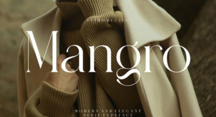
At first glance, Mangro appears to be a straightforward, modern sans-serif font. However, a closer inspection reveals subtle design details that set it apart from generic geometric typefaces. Its rounded edges, uniform strokes, and carefully balanced proportions give it a soft, modern charm. The typeface maintains a geometric foundation, but it avoids the coldness that many geometric sans serifs often have. Instead, Mangro feels warm, approachable, and well-suited for human-centered design.
The smooth curves and clean lines create a stylistic harmony that makes the font visually pleasing across various mediums. This makes Mangro ideal for inclusive branding, tech startups, minimal packaging, and lifestyle labels that aim for a modern yet friendly image. Its character shapes are dependable and consistent, providing a clean visual rhythm that enhances user experience in digital interfaces and printed materials alike.
More Infor: Click Here
Engineered for Readability
One of the greatest strengths of Mangro is its readability. Designers often look for typefaces that maintain clarity in different sizes and environments. Mangro’s balanced structure ensures excellent legibility, even when used in condensed layouts or small text sizes.
The font’s x-height is relatively high, and its strokes are consistent, making each letterform easy to distinguish. This helps maintain readability on mobile screens, websites, digital apps, and user interfaces. In print, Mangro performs just as well, making it a strong candidate for packaging labels, brochures, magazines, and minimalist editorial layouts.
Because it lacks unnecessary flourishes or dramatic forms, Mangro text looks steady, neutral, and clean—ideal for brands and creators who want their message to appear straightforward and trustworthy.

A Versatile Typeface for Modern Design Needs
One of the main reasons Mangro has gained widespread popularity is its versatility. It can be used in a wide range of design contexts without losing its identity. Whether you need something bold for marketing graphics or subtle for user interface elements, Mangro adapts effortlessly.
-
Branding: Many modern brands prefer clean, sans serif typefaces that communicate professionalism and simplicity. Mangro’s smooth geometry and friendly appearance make it an excellent choice for logos, brand names, and corporate identities.
-
Editorial Design: In magazines, brochures, and catalogs, Mangro works well for headings, subheadings, and body text, offering a clean, polished look.
-
Digital Interfaces: Web designers appreciate its clarity on screens, making it suitable for dashboards, app interfaces, landing pages, and navigation menus.
-
Advertising & Posters: The font’s bold style options create strong visual impact, ensuring promotional materials remain eye-catching and easy to read.
-
Product Packaging: Clean sans serif fonts like Mangro are widely used in skincare, beauty, tech accessories, and food packaging due to their modern and minimalistic appeal.
This adaptability allows designers to build entire visual systems with Mangro alone, creating consistent, cohesive branding.
A Modern Sans Serif with Personality
Many sans serif typefaces prioritize neutrality to the point of being almost invisible. Mangro, however, maintains a distinctive character without becoming overly stylized. Small details in the curves and proportions give the typeface a soft, almost humanistic essence while keeping the geometric structure intact.
This blend of minimalism and personality makes Mangro appealing to designers who want something modern but not sterile, friendly but not childish, clean but not bland. It is expressive enough for creative design and stable enough for professional environments.
Supporting Clean and Minimalist Aesthetics
Minimalist design has grown more dominant over the years as brands seek simplicity and clarity. Mangro complements this trend perfectly. Its clean letterforms, open spacing, and geometric foundation align well with uncluttered layouts and modern grid systems.
Whether used in monochrome color palettes, minimalist posters, clean website headers, or simple packaging layouts, Mangro contributes to a style that feels fresh, modern, and visually balanced. It helps designers maintain a sense of order and refinement without sacrificing character.
Ideal for Contemporary Branding and Future-Friendly Design
Today’s design landscape requires fonts that not only look good but also evolve with digital trends. Mangro’s modern construction ensures it remains relevant in the long term. As digital interfaces continue to prioritize clarity and accessibility, Mangro’s readability-focused design fits seamlessly into future-focused branding strategies.
Its friendly geometry and strong visual presence make it ideal for brands aiming to connect with younger audiences, tech-savvy customers, or lifestyle-oriented communities.
