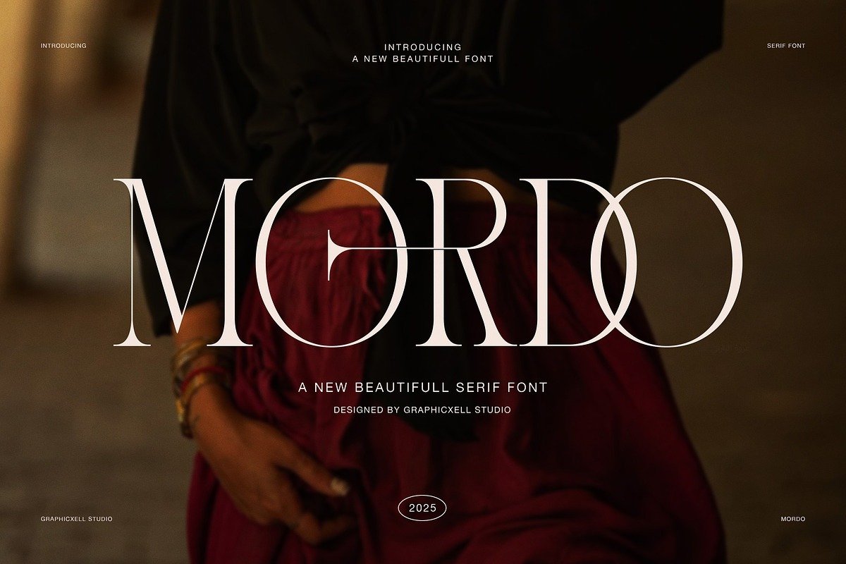
Mordo Font: A Modern Serif That Blends Strength, Elegance, and Contemporary Style
Typography is more than just the selection of letters—it’s a visual language that communicates tone, personality, and intent before a single word is read. Modern designers understand that choosing the right typeface can elevate a brand, reinforce a message, or define the identity of a project. Among today’s serif typefaces, Mordo Elegant Modern Serif Font has emerged as a distinct and powerful option, blending classical serif traditions with modern style and sophistication.
In this article, we’ll explore what Mordo Font is, what makes it unique, how it performs across different design contexts, and why it’s earning attention from designers seeking bold yet refined typography.
What Is Mordo Font?
Mordo Font is an elegant modern serif typeface designed with a focus on expressive character, refined proportions, and contemporary presence. It was created to embody strength and luxury while retaining clear readability and a clean, editorial aesthetic.
Unlike traditional serif fonts that might feel too classic or old-fashioned for many digital contexts, Mordo strikes a balance that speaks to modern design sensibilities. Its tall letterforms and confident stroke contrast give it visual impact, while subtle details maintain refinement and sophistication.
The font is often used where designers want both visual authority and aesthetic finesse—whether in editorial spreads, high-end branding, or bold headlines.
Design Characteristics and Visual Style
The visual identity of Mordo Font is defined by several key design traits that contribute to its elegance and versatility:
1. Tall, Refined Letterforms
Mordo’s characters are designed with a tall x-height and long, graceful letter shapes. This structure gives the font a commanding presence without feeling heavy or clumsy, making it particularly effective in larger sizes where the details can shine.
2. Strong Contrast and Sharp Features
A hallmark of Mordo’s style is its refined contrast between thick and thin strokes, which adds drama and visual dynamism. Combined with precisely drawn serifs, this contrast enhances both legibility and decorative appeal, striking a balance that is elegant yet assertive.
3. Refined Ligatures and Rhythm
The inclusion of well-designed ligatures and thoughtful spacing helps create a visual rhythm that feels organic and connected. These subtleties make extended text feel more cohesive and harmonious, particularly in headings or stylized paragraphs.
4. Timeless Yet Contemporary Structure
While rooted in serif tradition, Mordo feels unmistakably modern. There’s a contemporary freshness to the font’s proportions and shape choices that prevents it from feeling too rooted in any specific historical era, making it highly adaptable across media.
Where Mordo Excels — Practical Use Cases
Mordo Font’s design makes it ideal for a wide range of creative and commercial projects. Below are some of the most compelling use cases where this serif typeface truly shines:
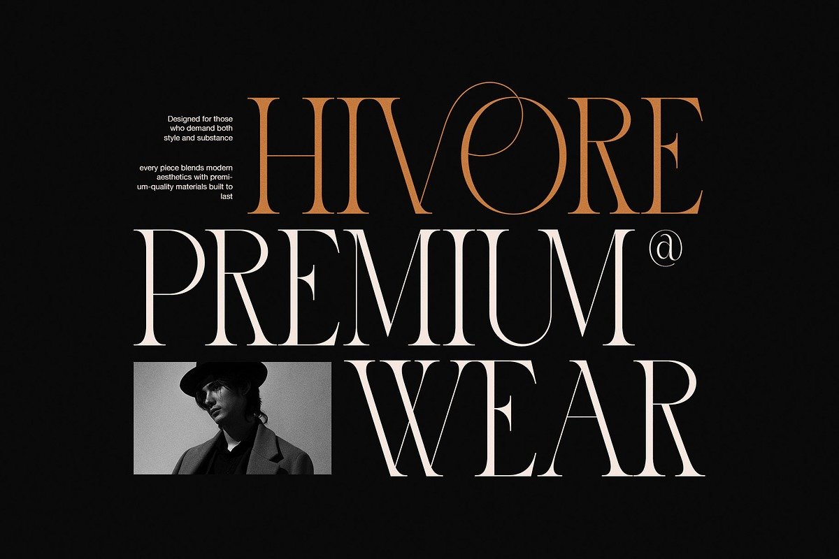
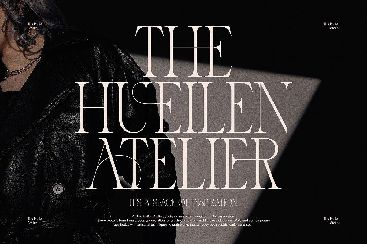
1. Branding and Identity
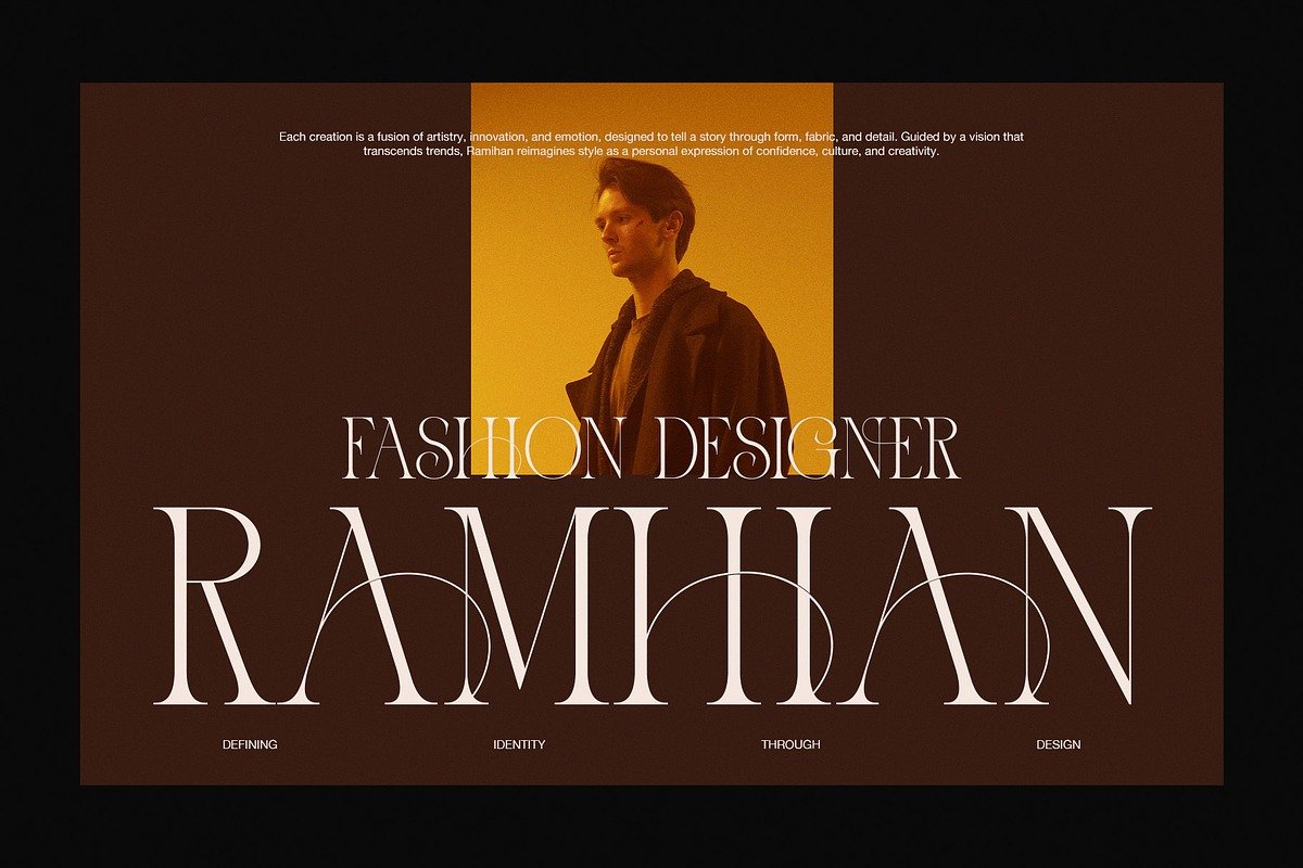
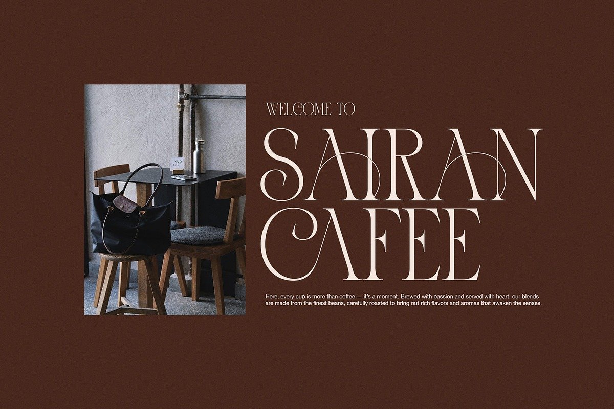
Designing a strong and memorable brand often starts with selecting a typeface that conveys personality and values. Mordo is particularly effective for brands that aim to communicate luxury, sophistication, and confidence—think high-end fashion labels, boutique design studios, interior brands, premium cafes, and lifestyle companies.
In logo design and brand identity systems, Mordo can serve as a core visual element that instantly elevates the overall look and feel.
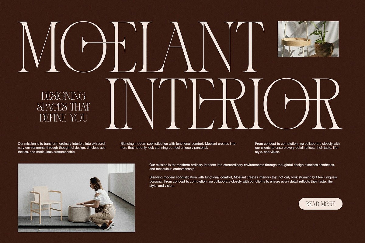
2. Editorial Design
Editorial work demands typefaces that are both expressive and readable. Mordo’s refined stroke contrast and clear letterforms make it an excellent choice for magazine titles, feature headlines, or stylized pull quotes.
When used sparingly with supporting typography for body text, Mordo creates a luxurious reading experience that feels intentional and artistic.
3. Advertising and Marketing
For campaigns, posters, and social media graphics, Mordo stands out as a display typeface that attracts attention. Its dramatic presence helps headlines and taglines feel bold and compelling, which is crucial for visual marketing efforts.
4. Packaging and Product Design
High-end product packaging often relies on typography to communicate quality and desirability. Mordo’s elegant structure makes it well-suited for cosmetics, perfumes, fine food products, and bespoke goods where typography plays a central role in user perception.
5. Digital Interfaces
Although serif fonts have historically been associated with print, modern high-resolution screens have broadened their usability online. Mordo transitions smoothly into digital use for web headers, landing pages, hero sections, and more, especially when paired with clean sans-serif fonts for body text.
Pairing Mordo With Complementary Fonts
Good typography rarely exists in isolation. Mordo performs exceptionally well when paired with neutral sans-serif fonts that can balance its expressive character. Examples include minimalist sans families that don’t compete with Mordo’s dramatic serifs but instead let them shine in headlines or key visual elements.
This kind of typographic pairing creates a strong hierarchy and visual contrast, which helps guide the reader’s attention and improves overall design structure.
Emotional and Psychological Impact
Typefaces carry emotional weight. Serif fonts like Mordo often evoke a sense of credibility, tradition, and elegance. When these traits are combined with a contemporary twist, they also convey confidence and modern style—a powerful combination for brands and designers seeking to communicate both legacy and relevance.
Mordo’s personality can subtly influence how an audience perceives a design, making it feel more polished, purposeful, and premium. Choosing it thoughtfully can elevate the emotional impact of your typography.
Best Practices for Using Mordo
To get the most out of Mordo Font in your design work, consider the following tips:
Use Mordo for Headlines and Logos: Its strength and visual weight are best showcased where it has room to breathe.
Pair it with Clean Sans-Serifs: For body text, combine Mordo with simpler fonts to maintain readability and balanced contrast.
Give It Space: Generous white space around Mordo text enhances its elegance and impact.
Leverage Ligatures Intentionally: Use ligatures for stylistic flair in titles or highlighted text, but avoid overuse in dense paragraphs.
Conclusion
Mordo Elegant Modern Serif Font is more than a serif typeface—it’s a design tool that communicates strength, luxury, and modern sophistication. With tall, refined letterforms, thoughtful stroke contrast, and expressive ligatures, it offers designers a compelling way to elevate their visual language across branding, editorial design, advertising, and more.
Whether you’re crafting a bold headline, a high-end logo, or a fashion editorial, Mordo brings clarity, character, and a timeless contemporary feel that few other modern serif fonts achieve. It stands as a testament to how thoughtful type design can transform not just words, but the way people experience them.