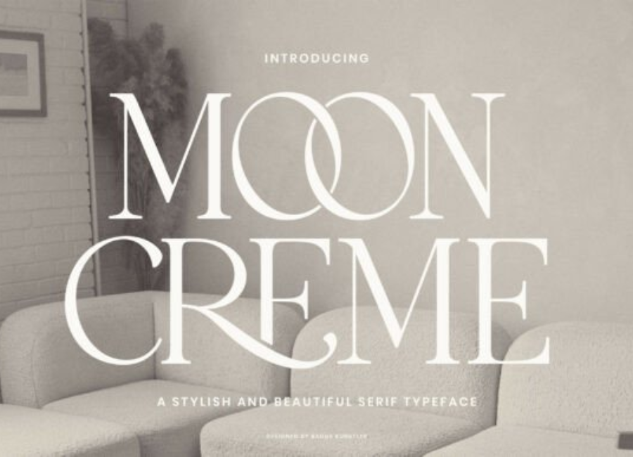
Moon Creme Font: A Soft, Elegant Typeface with Modern Charm
The Moon Creme font is a beautifully crafted typeface that blends softness, elegance, and modern simplicity into one cohesive design. With its gentle curves, creamy strokes, and smooth letterforms, Moon Creme offers designers a versatile font choice that feels both refined and approachable. Whether used for branding, editorial layouts, packaging, or digital content, this font delivers a calming visual presence that stands out without overwhelming the viewer.
Design Style and Character
Moon Creme falls into the category of modern serif or soft display fonts, depending on how it is used. Its defining feature is the subtle balance between structure and fluidity. The letterforms are well-proportioned, with rounded edges and consistent stroke weight that create a harmonious rhythm across words and sentences.
Unlike sharp or overly dramatic typefaces, Moon Creme embraces a gentle aesthetic. The curves feel intentional and smooth, giving the font a “creamy” visual texture—true to its name. This softness makes it ideal for projects that require warmth, elegance, and a sense of calm sophistication.
Readability and Visual Appeal
One of Moon Creme’s strongest qualities is its excellent readability. Despite its decorative charm, the font maintains clear letter distinction, making it suitable not only for headlines but also for short paragraphs and subheadings. The spacing between letters is well balanced, allowing text to breathe and flow naturally on the page.
When used in larger sizes, Moon Creme shines as a display font, capturing attention with its refined curves and graceful forms. At smaller sizes, it remains legible and clean, especially when paired with a neutral sans-serif font for body text. This adaptability makes it a practical choice for both print and digital design projects.
Ideal Use Cases
Moon Creme is a versatile font that works beautifully across a wide range of creative applications:
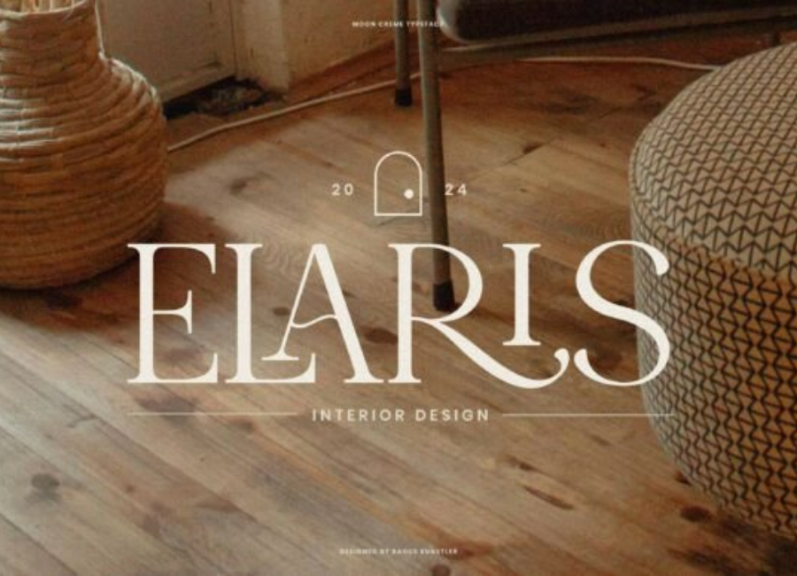
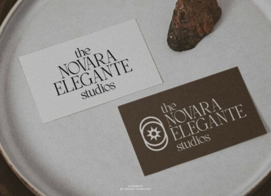
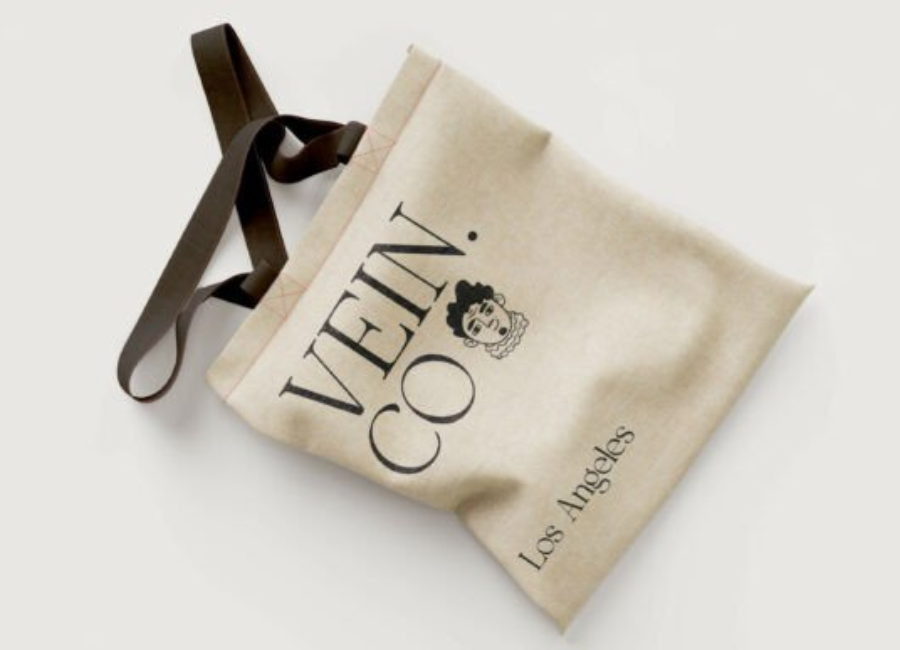
Branding and Logos Moon Creme is particularly well suited for branding projects that aim to communicate elegance, trust, and softness. Beauty brands, skincare lines, fashion labels, cafés, and lifestyle businesses can benefit from its polished yet friendly appearance. The font’s refined character helps create logos that feel timeless and premium.
Editorial and Print Design In magazines, lookbooks, and brochures, Moon Creme adds a sophisticated touch without appearing too formal. It works well for headlines, pull quotes, and section titles, enhancing visual hierarchy while maintaining a cohesive aesthetic.
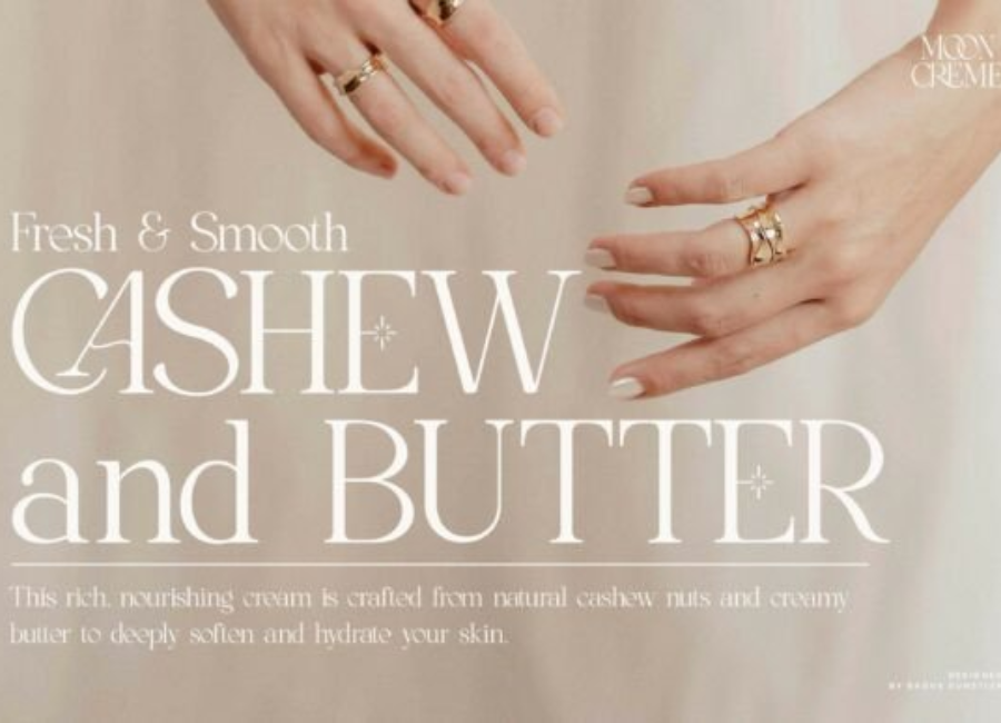
Packaging Design For product packaging—especially in cosmetics, wellness, handmade goods, or boutique food items—Moon Creme offers an inviting and luxurious feel. Its smooth curves and elegant strokes help convey quality and care, making products appear more refined and thoughtfully designed.
Social Media and Digital Content Moon Creme performs exceptionally well in social media graphics, website headers, and promotional banners. Its clarity and charm ensure that messages remain readable on screens while still looking stylish and engaging.
Emotional Impact and Brand Personality
Fonts play a significant role in shaping how audiences perceive a brand, and Moon Creme excels in conveying the right emotions. It communicates calmness, softness, and elegance, making it ideal for brands that prioritize comfort, beauty, and authenticity.
The font’s gentle appearance can evoke feelings of warmth and trust, which are especially valuable in industries like wellness, beauty, and lifestyle. At the same time, its clean structure ensures it still feels modern and professional rather than overly decorative.
Pairing Moon Creme with Other Fonts
To create balanced and visually appealing designs, Moon Creme pairs best with simple, clean typefaces. Sans-serif fonts such as Montserrat, Lato, or Open Sans work well alongside Moon Creme, providing contrast while maintaining harmony. For more editorial designs, pairing it with a minimal serif font can enhance sophistication without cluttering the layout.
Using Moon Creme as a headline or accent font while keeping body text minimal allows its unique character to shine without compromising readability.
Technical Quality and Versatility
Moon Creme is designed with consistency and usability in mind. The font maintains uniform stroke weight and smooth curves across all characters, ensuring a polished and professional finish. It performs well across various platforms, including print materials, websites, and mobile applications.
Its versatility allows designers to experiment with different color palettes, from soft neutrals and pastels to bold, high-contrast combinations. No matter the color choice, Moon Creme retains its elegant charm.
Final Thoughts
Moon Creme is more than just a typeface—it is a design tool that brings softness, elegance, and modern appeal to any project. Its creamy curves, balanced proportions, and refined aesthetic make it an excellent choice for designers seeking a font that feels warm yet professional.
Whether you are creating a brand identity, designing packaging, or crafting digital content, Moon Creme offers the flexibility and visual appeal needed to elevate your work. Its timeless charm and contemporary style ensure that designs remain relevant, stylish, and emotionally engaging for years to come.