Gafia Font: A Modern Typeface with Clean Elegance and Strong Identity
The Gafia font is a contemporary typeface designed to balance clarity, elegance, and versatility. With its clean structure, refined proportions, and modern aesthetic, Gafia is a font that fits seamlessly into a wide range of creative projects. It is crafted for designers who value readability without sacrificing style, making it a reliable choice for branding, editorial design, digital interfaces, and print materials.
In today’s design landscape, where visual simplicity and strong identity go hand in hand, Gafia stands out as a font that communicates professionalism while maintaining character. Its thoughtful design ensures that text appears polished, confident, and visually engaging across different mediums.
Design Style and Characteristics
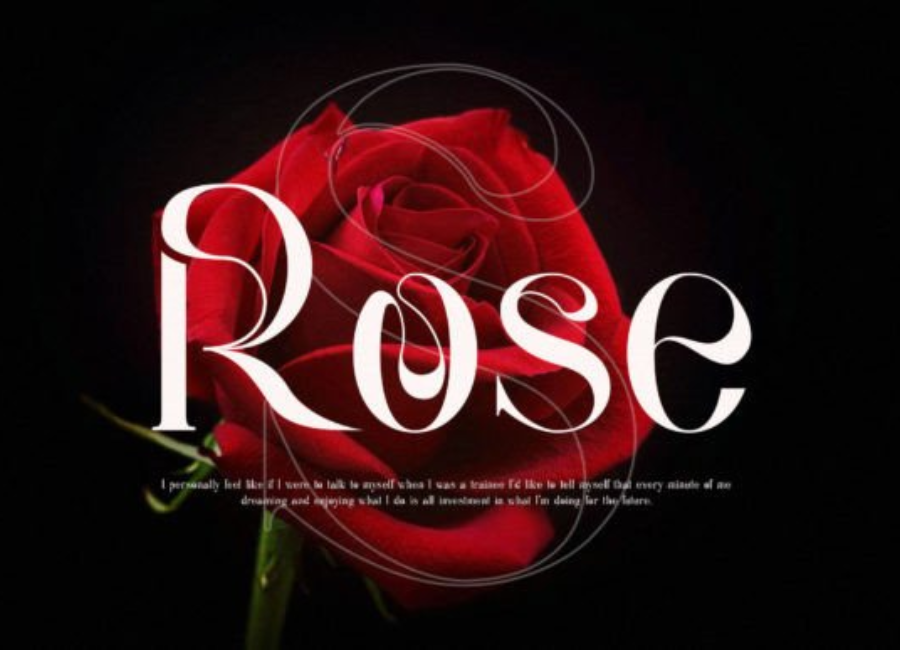
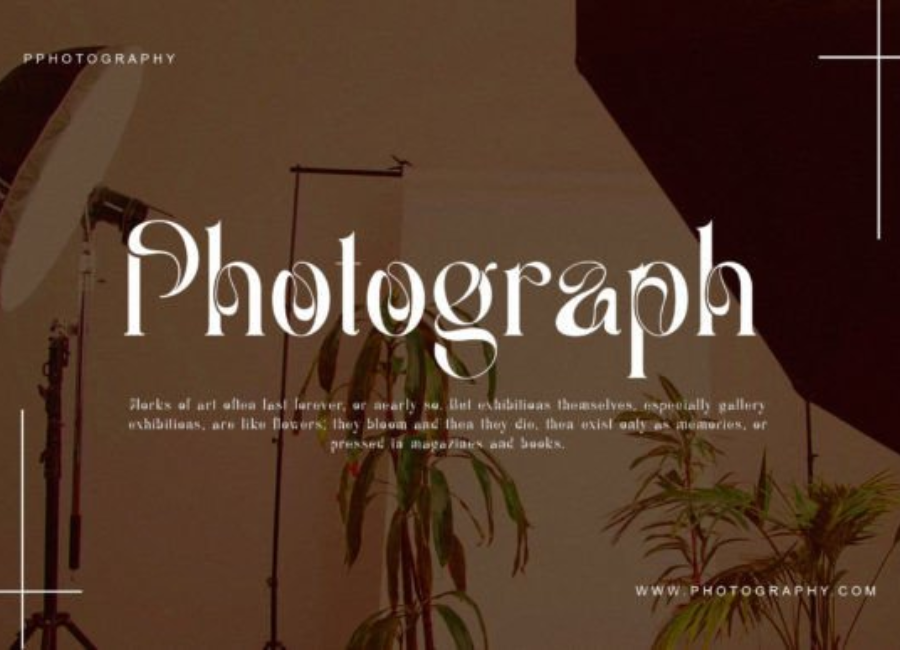
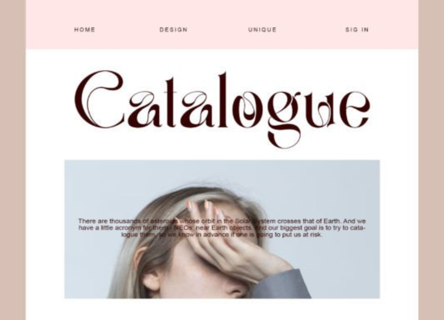
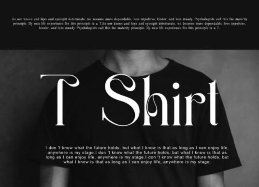
Gafia is best described as a modern serif or contemporary display font, depending on its application. The letterforms are structured yet smooth, combining sharp details with subtle curves that soften the overall appearance. This balance gives the font a refined personality—neither overly decorative nor too minimal.
The strokes are consistent and well-weighted, contributing to a cohesive look throughout the character set. Each letter feels intentional, with carefully shaped terminals and balanced proportions. The result is a font that feels timeless while still aligning with modern design trends.
Gafia’s design avoids unnecessary complexity, allowing it to remain visually clean and adaptable. This makes it suitable for both bold headlines and refined text elements, depending on how it is styled and scaled.
Readability and Functionality
One of Gafia’s greatest strengths is its excellent readability. The clear distinction between characters ensures that text remains easy to read, even at smaller sizes. This makes Gafia a practical choice for both display use and short paragraphs, especially in editorial or branding contexts.
The spacing between letters is carefully calibrated, allowing words to flow naturally without appearing cramped or overly loose. This balance enhances legibility and contributes to a comfortable reading experience across print and digital platforms.
When used at larger sizes, Gafia’s details become more pronounced, making it ideal for headlines, titles, and hero text. At smaller sizes, it maintains clarity and professionalism, which is essential for modern design applications.
Ideal Use Cases
Gafia’s versatility allows it to perform well across a broad range of creative projects. Its refined yet modern appearance makes it suitable for both corporate and creative industries.
Branding and Visual Identity Gafia is an excellent font for brand identities that aim to communicate trust, sophistication, and modernity. It works well for logos, brand names, and taglines, especially for businesses in technology, consulting, fashion, wellness, and creative services. The font’s clean structure ensures that brand messages remain clear and memorable.
Editorial and Publishing In magazines, books, and online publications, Gafia enhances visual hierarchy and readability. It can be used for headlines, subheadings, pull quotes, and featured text, adding elegance without overpowering the layout. Its balanced design helps maintain a professional editorial tone.
Web and Digital Design Gafia performs exceptionally well in digital environments. Websites, landing pages, and mobile applications benefit from its clarity and modern aesthetic. The font adapts smoothly to different screen sizes, ensuring consistency and readability across devices.
Packaging and Product Design For packaging that requires a refined and premium feel, Gafia is a strong choice. It works well for luxury goods, lifestyle products, cosmetics, and boutique brands, helping convey quality and attention to detail.
Typography influences how audiences perceive a brand, and Gafia excels at communicating confidence and sophistication. Its clean lines and balanced proportions evoke a sense of stability, trust, and elegance. This makes it ideal for brands that want to appear professional, modern, and reliable.
At the same time, Gafia’s subtle stylistic details prevent it from feeling cold or generic. It carries enough personality to feel distinctive, helping brands stand out while maintaining a polished appearance.
Pairing Gafia with Other Fonts
To create visually balanced designs, Gafia pairs well with minimalist typefaces. Clean sans-serif fonts such as Inter, Poppins, or Helvetica complement Gafia by providing contrast and simplicity. This pairing works especially well in branding and web design, where clarity and hierarchy are essential.
For more editorial or luxury-focused designs, Gafia can be paired with a lighter serif or a refined script font for accents. Using Gafia as the primary font and reserving decorative fonts for subtle highlights ensures a cohesive and professional layout.
Color choices also influence how Gafia is perceived. Neutral tones emphasize its elegance, while bold color palettes can give it a more contemporary and dynamic feel.
Versatility Across Media
Gafia is designed to perform consistently across various media formats. Whether printed on paper, displayed on screens, or used in large-scale signage, the font maintains its integrity and clarity. This adaptability makes it a dependable choice for designers working across multiple platforms.
Its versatility allows it to shift seamlessly between formal and creative contexts. With slight adjustments in spacing, size, or color, Gafia can appear corporate, artistic, minimal, or luxurious.
Technical Quality and Design Precision
The technical construction of Gafia reflects a high level of craftsmanship. The characters are well-aligned, the curves are smooth, and the overall structure feels cohesive and professional. This precision ensures that the font integrates smoothly into modern design software and workflows.
Designers can rely on Gafia for consistent performance, knowing that it will maintain visual quality across different applications and resolutions.
Why Designers Choose Gafia
Designers choose Gafia because it offers reliability, elegance, and flexibility in one typeface. It provides a strong foundation for design projects that require clarity and sophistication without unnecessary embellishment. Gafia allows typography to support the message rather than distract from it.
Its modern aesthetic and balanced character make it especially appealing to designers working in branding, editorial design, and digital media, where both form and function are equally important.
Final Thoughts
Gafia is a modern, elegant font that combines readability with refined design. Its clean structure, balanced proportions, and versatile personality make it an excellent choice for a wide range of creative projects. From branding and editorial layouts to digital interfaces and packaging, Gafia delivers consistent quality and visual appeal.
For designers seeking a font that feels contemporary, professional, and adaptable, Gafia is a dependable and stylish solution. It enhances designs with subtle sophistication, ensuring that typography remains clear, confident, and visually engaging in any context.