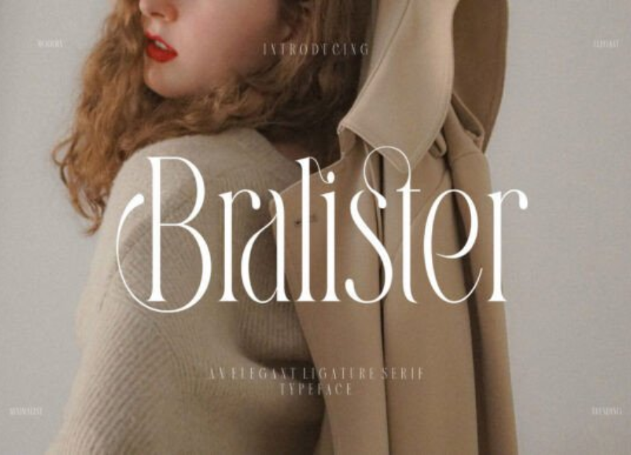
Bralister Font: A Modern Serif with Timeless Craftsmanship
The Bralister font is a sophisticated serif typeface that blends classic elegance with a modern design approach. Known for its graceful curves, luxurious detailing, and refined form, Bralister has become a top choice among designers who seek a font that feels both timeless and contemporary. Whether used for branding, packaging, editorials, or digital interfaces, Bralister offers a polished aesthetic that elevates any visual composition.
A Distinctive Style with Modern Refinement
At first glance, Bralister captures attention with its striking serif structure. Its letterforms feature balanced proportions, smooth transitions, and expressive details that distinguish it from traditional serif fonts. While it draws inspiration from old-style typography, Bralister adds a modern twist through subtle curves, sharp terminals, and a high contrast between thick and thin strokes.
This blend of old and new makes Bralister an appealing choice for designers who want sophistication without sacrificing contemporary appeal. It communicates professionalism, luxury, and artistic flair—qualities that suit premium branding and upscale design projects.
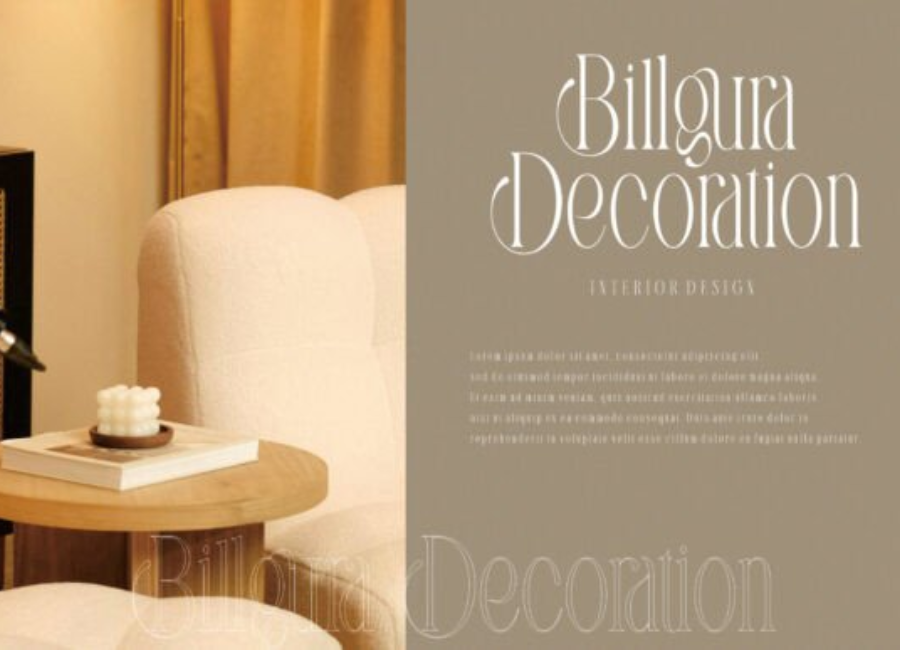
Elegant Letterforms Crafted for Display and Headings
Bralister excels particularly in display settings. Its decorative elements and refined shapes shine in large sizes, making it perfect for:
Magazine titles
Branding logos
Packaging design
Wedding invitations
Poster headlines
The font’s graceful serifs and distinctive character shapes help it stand out and leave a memorable impression. Even in minimal layouts, Bralister adds a sense of richness and sophistication that makes the design feel intentional and high-quality.
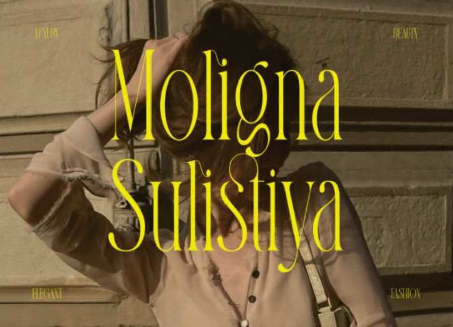
Balanced Readability and Visual Impact
While Bralister is highly expressive, it is also surprisingly readable. Its internal structure is carefully designed to maintain clarity in both print and digital environments. The proportional spacing, consistent stroke rhythm, and considered x-height contribute to excellent readability—even in medium sizes.
This balance between visual artistry and practical function is one of Bralister’s strongest qualities. It allows designers to use the font for not only titles and headlines but also short paragraphs, taglines, and editorial intros that require both beauty and clarity.
Versatility Across Design Fields
Bralister’s ability to adapt to various visual themes makes it a versatile font for diverse design needs. It works wonderfully in:
Whether used in minimal monochrome layouts or rich, decorative compositions, Bralister maintains its strong aesthetic presence while supporting the tone of the design.
A Font That Enhances Modern Storytelling
Typography plays a powerful role in shaping the emotional atmosphere of a design. Bralister contributes to this storytelling by adding elegance, authority, and artistic nuance. Its classic roots make it feel familiar, while its modern refinements bring freshness and contemporary relevance.
This fusion helps designers create visual experiences that feel polished, cohesive, and emotionally resonant.
Conclusion
Bralister is more than just a serif font—it is a blend of artistry, refinement, and modern craftsmanship. Its elegant letterforms, sophisticated details, and thoughtful proportions make it an invaluable asset for designers aiming to elevate their work. Whether crafting a premium brand identity, designing editorial layouts, or creating stylish digital content, Bralister adds a distinctive touch that enhances clarity, beauty, and visual sophistication.