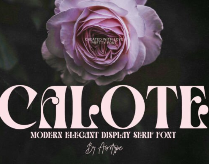
Calote Font: A Bold Synthesis of Modern Style, Artistic Edge, and Visual Expression
In the diverse and ever-evolving world of typography, every font carries its own voice, personality, and aesthetic resonance. Some fonts are subtle and reserved, others stylish and extravagant. Among these varied typographic identities, the Calote Font stands out as a powerful hybrid of modern artistry, bold expression, and refined design principles. With its distinctive shapes, sweeping curves, and edgy details, Calote has captured the attention of designers who seek a typeface capable of making a striking impression while still maintaining clarity and functionality. Its presence in branding, advertising, editorial layout, and digital design demonstrates the versatility and creative strength this font brings to visual communication.
At its core, Calote Font embodies a contemporary calligraphic essence. It merges the elegance of script-inspired forms with the structure of modern lettering. This blend allows it to straddle the line between artistic flourish and professional polish. While many decorative fonts lean heavily toward ornamental exaggeration, Calote manages to maintain subtlety within its expressive strokes. Its curves are sophisticated, its lines precise, and its overall rhythm balanced. This design harmony gives the font a unique ability to be both eye-catching and aesthetically consistent.
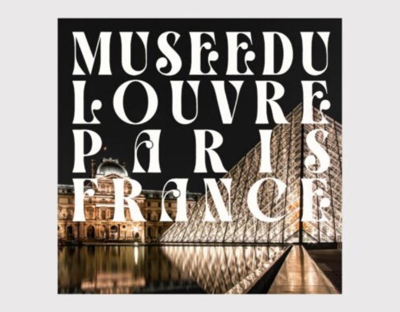
One of the most remarkable qualities of Calote Font is its bold visual energy. The characters often feature dynamic swashes, fluid contours, and rhythmic transitions that imitate the movement of hand-drawn lettering. Yet, unlike traditional cursive or script fonts, Calote maintains a more structured and contemporary form. The letterforms are clear, intentional, and confident, giving the typeface a striking personality without sacrificing readability. It is this combination of artistry and clarity that makes Calote popular in cinematic titles, luxury branding, fashion advertising, and lifestyle product packaging.
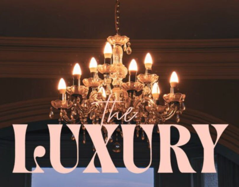
In branding, a font must deliver a memorable and emotionally resonant identity. Calote achieves this by projecting a sense of modern sophistication mixed with artistic soul. It holds a graceful charm while still feeling fresh and bold. Many designers turn to Calote when they want to evoke themes of elegance, creativity, premium quality, or expressive individuality. High-end fashion labels, artisan brands, beauty companies, boutique businesses, and creative agencies often gravitate to Calote for its upscale aesthetic. Its visual richness gives logos a stylish flair, while its legibility ensures the brand’s name remains clear and impactful.
Beyond aesthetics, the emotional tone of a typeface plays an essential role in graphic design. Calote Font carries a mood of confidence, creativity, and refined artistry. It feels intentional, expressive, and carefully constructed. Viewers often associate it with high-quality craftsmanship, artistic excellence, and contemporary luxury. This emotional weight is especially valuable in branding, where perception and storytelling matter as much as design. Calote gives designers the ability to convey sophistication without appearing overly formal, and creativity without appearing chaotic.
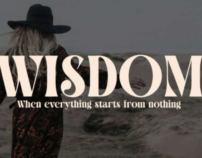
The versatility of Calote becomes particularly apparent in editorial and print applications. Magazine titles, creative spreads, product catalogs, lookbooks, and promotional posters benefit greatly from its bold stylistic presence. When used as a display font for headings, it naturally draws the reader’s attention, establishing hierarchy and emphasis. Its expressive curves pair beautifully with minimalist layouts, negative space, and high-contrast imagery. In more artistic layouts, Calote can amplify mood and theme, enhancing the visual narrative through its sculpted letterforms.
The font also excels in digital design, where clarity and visual impact must coexist. In website hero banners, social media graphics, promotional designs, and digital advertisements, Calote creates immediate visual attraction. Its bold flourishes and contemporary strokes stand out on screen, giving digital content a refined and engaging aesthetic. As modern design trends continue to favor expressive typography—especially in platforms like Instagram, TikTok, and Pinterest—Calote fits seamlessly into visual branding strategies that rely heavily on style and personality.
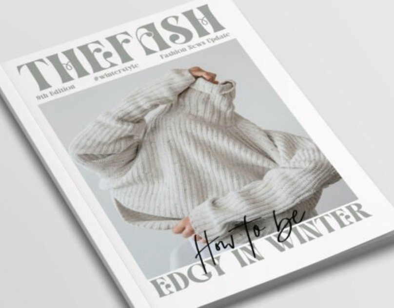
From a technical standpoint, Calote Font demonstrates thoughtful craftsmanship. The spacing, curves, and structural consistency reflect a deliberate design approach. Even with its artistic style, the character proportions remain balanced, ensuring that words and phrases form cohesive visual shapes. This contributes to readability, especially in medium-sized text. Calote works best as a display font, and when paired with clean sans-serifs like Poppins, Lato, or Helvetica, it creates beautiful typographic harmony. These pairings allow designers to build sophisticated layouts where Calote delivers the flair while simpler fonts bring structure and clarity.
Another key appeal of Calote is its adaptability to different moods and design contexts. With the right color schemes, textures, and graphic elements, Calote can shift from modern chic to creative bohemian, from elegant luxury to expressive artistic branding. In bold monochrome palettes, it feels sleek and high-end. When paired with pastel colors and soft imagery, it becomes warm and romantic. With metallic accents, gradients, or abstract compositions, the font transforms into a futuristic or avant-garde design element. This adaptability makes it a powerful tool for designers who want to build flexible visual identities.
Calote also aligns with broader design trends seen in recent years:
– the rise of handcrafted and artisanal aesthetics
– the popularity of expressive lettering styles
– increased use of display fonts in branding and packaging
– minimalist layouts paired with statement typography
Its form reflects contemporary visual language while still leaving space for creative interpretation. As more brands aim to appear relatable yet premium, expressive yet clear, Calote provides an ideal middle ground.
Typography, at its heart, is a means of communication—but it is also a form of artistry. Calote Font represents this duality beautifully. It is functional enough to be used in professional applications yet expressive enough to enhance creative storytelling. Whether a designer wants to communicate confidence, elegance, creativity, or modern flair, Calote offers a visual voice that resonates strongly.
In conclusion, Calote Font stands as a sophisticated fusion of modern design, expressive typography, and artistic character. Its bold curves, graceful strokes, and carefully sculpted shapes make it a standout choice for branding, editorial design, digital layouts, and creative projects. With its ability to evoke emotion, elevate aesthetics, and create memorable visual impressions, Calote remains a valuable typeface in the modern designer’s toolkit. For those seeking a font that blends contemporary elegance with artistic expression, Calote Font offers a compelling and timeless solution.