Cronde Font: A Bold Typeface with Modern Versatility
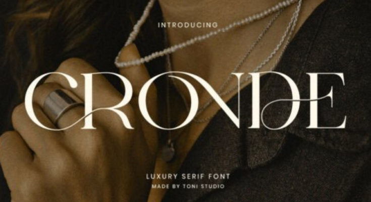
Typography is a fundamental element of design, influencing how messages are perceived and how brands connect with audiences. Cronde Font is a contemporary typeface that stands out for its bold presence, clean structure, and modern appeal. Designed to make an impact while remaining versatile, Cronde Font is well-suited for a wide range of creative and professional applications.
Whether used in branding, digital media, or print design, Cronde Font delivers clarity and confidence. Its strong visual character makes it a reliable choice for designers seeking a typeface that combines strength with refinement.

Design Concept and Inspiration
Cronde Font is built around modern design principles that emphasize clarity, balance, and functionality. The font draws inspiration from geometric and contemporary typographic styles, resulting in letterforms that feel structured and purposeful. Rather than relying on decorative details, Cronde Font focuses on bold shapes and clean lines to create a strong visual identity.
This design approach allows the font to feel current and professional, making it ideal for brands and projects that want to communicate confidence, innovation, and reliability.
Distinctive Visual Characteristics
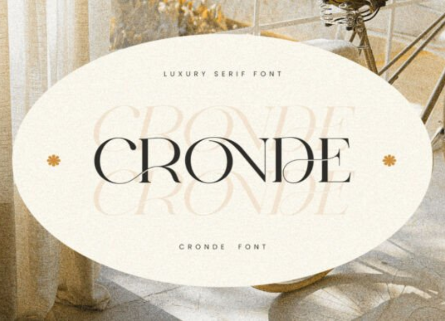
One of the defining features of Cronde Font is its bold and well-defined letterforms. The strokes are consistent and balanced, giving the font a solid and cohesive appearance. Rounded corners and smooth curves soften the overall look, preventing it from feeling overly rigid or mechanical.
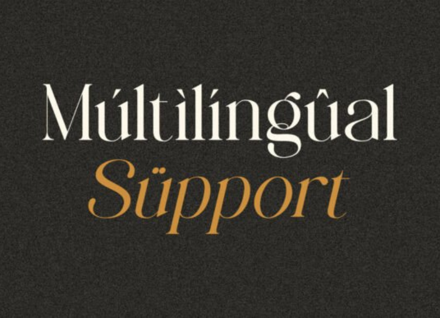
Uppercase letters are powerful and commanding, making them perfect for headlines, logos, and titles. Lowercase characters maintain readability and flow, ensuring that the font works well in both short phrases and extended text elements. Carefully crafted spacing and kerning contribute to its polished and professional finish.
These visual traits make Cronde Font stand out while maintaining excellent legibility.
Versatile Design Applications
Cronde Font’s bold yet adaptable design makes it suitable for a wide range of creative projects across both print and digital platforms.
Branding and Logo Design
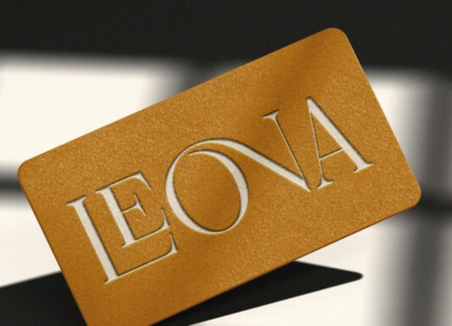
Cronde Font is an excellent choice for modern branding. Its strong presence helps logos appear confident and memorable, making it ideal for technology companies, creative agencies, startups, and lifestyle brands. The font conveys professionalism while still allowing room for creative expression.
Editorial and Print Media
In magazines, brochures, posters, and catalogs, Cronde Font works effectively for headlines, section titles, and callouts. Its bold structure helps guide the reader’s attention and establishes a clear visual hierarchy within the layout.
Web and Digital Design
For websites, mobile apps, and social media graphics, Cronde Font offers excellent screen readability. Its clean shapes and balanced proportions ensure that text remains clear across different devices and resolutions, making it a reliable choice for digital content.
Advertising and Marketing Materials
Cronde Font is particularly effective in advertising, where visibility and impact are essential. It performs well on banners, billboards, flyers, and promotional graphics, helping messages stand out quickly and clearly.
Font Pairing and Typography Balance
Because it has a strong visual identity, pairing it with complementary fonts is key to achieving balanced designs. Simple sans-serif or neutral serif fonts work well for body text, allowing them to shine in headings and key elements.
Designers often pair it with fonts like Open Sans, Roboto, or Merriweather to create contrast and maintain readability. This combination ensures a clean and professional layout without visual clutter.
Emotional Tone and Brand Communication
Cronde Font communicates confidence, strength, and modernity. Its bold structure helps brands project authority and clarity, making it particularly suitable for corporate branding, technology-focused projects, and professional communications.
At the same time, its smooth curves and balanced design prevent it from feeling harsh or unapproachable. This allows it to adapt to both serious and creative contexts, depending on how it is styled and applied.
Readability and Practical Use
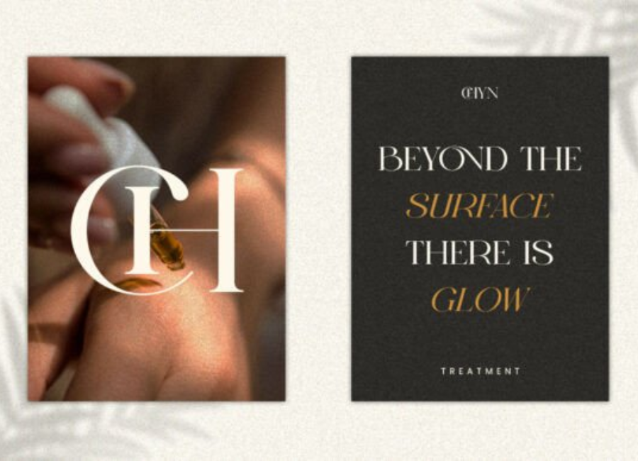
Despite its bold appearance, it maintains excellent readability. It performs well at various sizes, making it suitable for everything from large display text to smaller supporting elements. However, like many bold display fonts, it is most effective when used strategically rather than for long paragraphs.
Proper spacing, alignment, and contrast help maximize its visual impact and clarity.
Why Designers Choose Cronde Font
Cronde Font has become a popular choice among designers for several reasons:
-
Bold and modern design style
-
High versatility across branding, print, and digital projects
-
Strong readability and clean letterforms
-
Professional yet expressive appearance
-
Suitable for both creative and corporate use
These qualities make a valuable addition to any typography collection.

Conclusion
Cronde Font is a powerful and modern typeface that combines bold design with versatile functionality. Its clean structure, strong visual presence, and excellent readability make it an ideal choice for designers seeking a font that delivers impact without sacrificing clarity.
Whether used in branding, editorial layouts, advertising, or digital media, it enhances visual communication with confidence and style. For creatives looking to make a strong impression, it offers a dependable and visually striking typographic solution.
