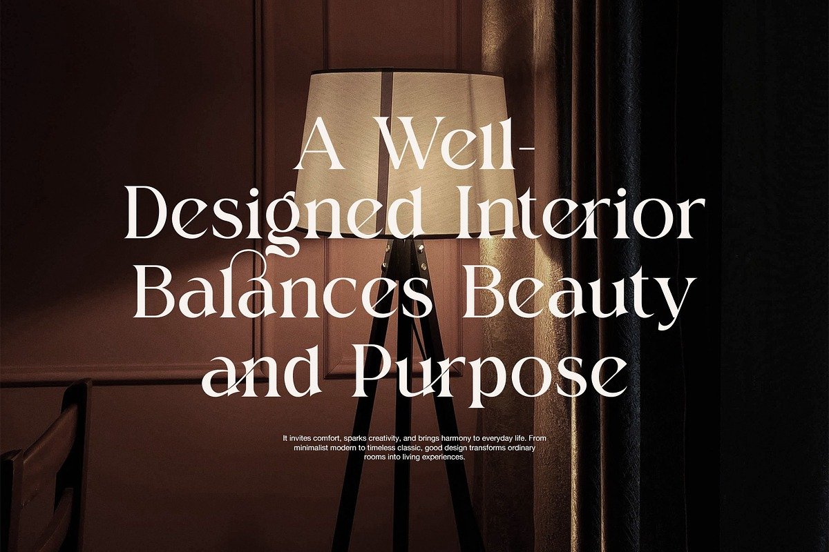
Molgin Elegant Serif Font: A Timeless Typeface for Modern Sophistication
Typography is more than just letters on a page—it is a voice, a mood, and a visual identity. Among the many serif typefaces available today, Molgin Elegant Serif Font stands out as a refined and expressive choice that blends classic typography traditions with contemporary design sensibilities. Designed for creatives who value elegance, readability, and versatility, Molgin offers a distinctive character that elevates both digital and print projects.
In this article, we explore the design philosophy, key features, use cases, and creative potential of the Molgin Elegant Serif Font, and why it has become a popular choice for designers seeking timeless sophistication.
The Essence of Molgin: Elegance Meets Character
Molgin is an elegant serif typeface characterized by graceful letterforms, balanced proportions, and subtle decorative details. Unlike overly ornate serif fonts that can feel heavy or dated, Molgin strikes a careful balance—its design is expressive without being distracting.
The font’s elegance comes from:
Smooth contrast between thick and thin strokes
Well-defined serifs that feel refined rather than rigid
Thoughtfully shaped curves that add warmth and personality
This balance allows Molgin to feel both classic and modern, making it adaptable across a wide range of creative applications.
Design Philosophy and Visual Style
At its core, Molgin is inspired by traditional serif typography often seen in editorial design, luxury branding, and classic literature. However, it has been modernized to meet today’s design needs, especially in digital environments.
Key stylistic traits include:
High readability: Even with its elegant details, Molgin maintains clear letterforms that remain legible at various sizes.
Refined contrast: The stroke contrast adds sophistication without sacrificing clarity.
Harmonious spacing: Careful kerning and spacing give the text a polished, professional appearance.
These characteristics make Molgin ideal for projects where visual credibility and aesthetic refinement are essential.
Versatility Across Design Applications
One of Molgin’s greatest strengths is its versatility. While it naturally shines in luxury and editorial contexts, it is far from limited to them.
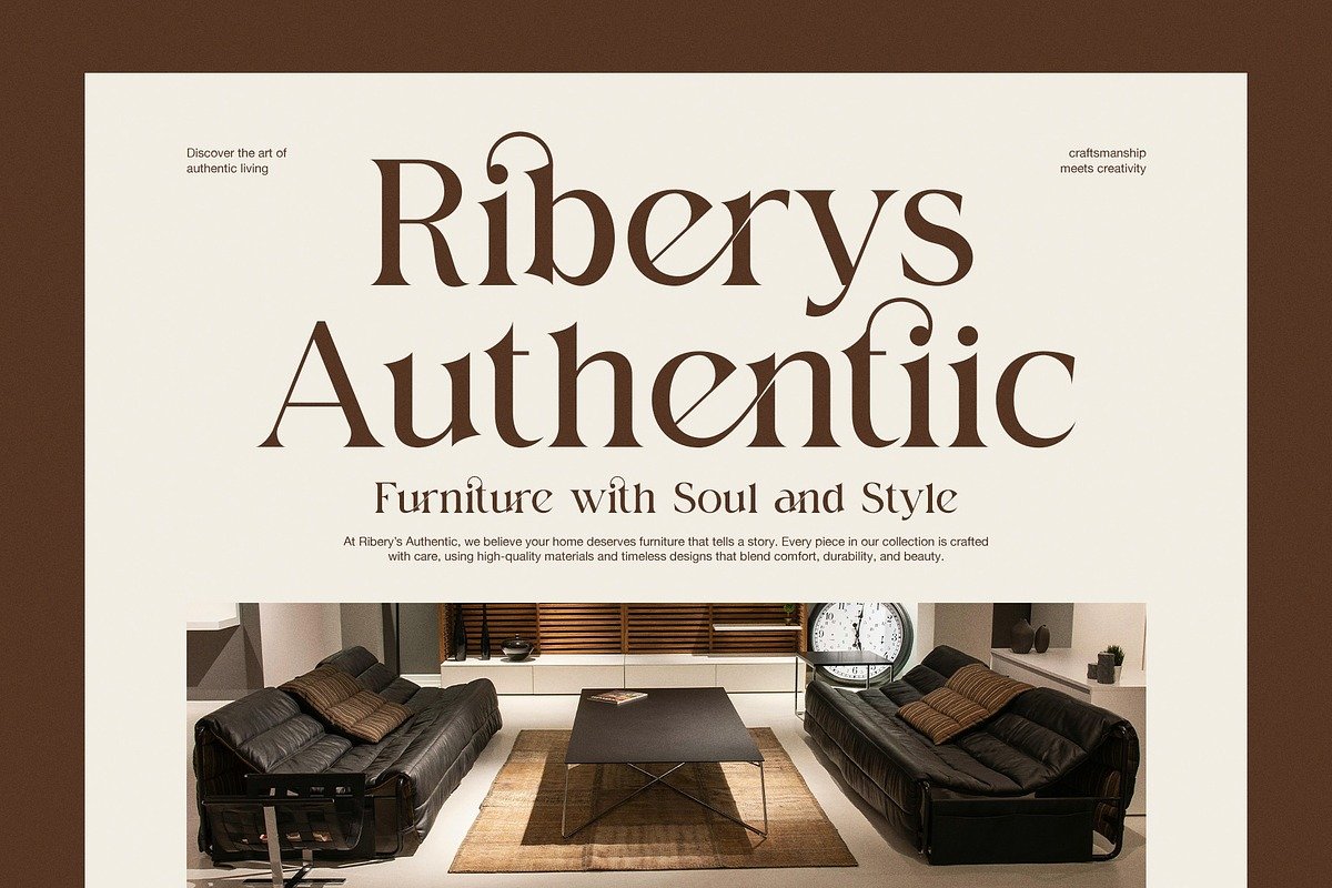
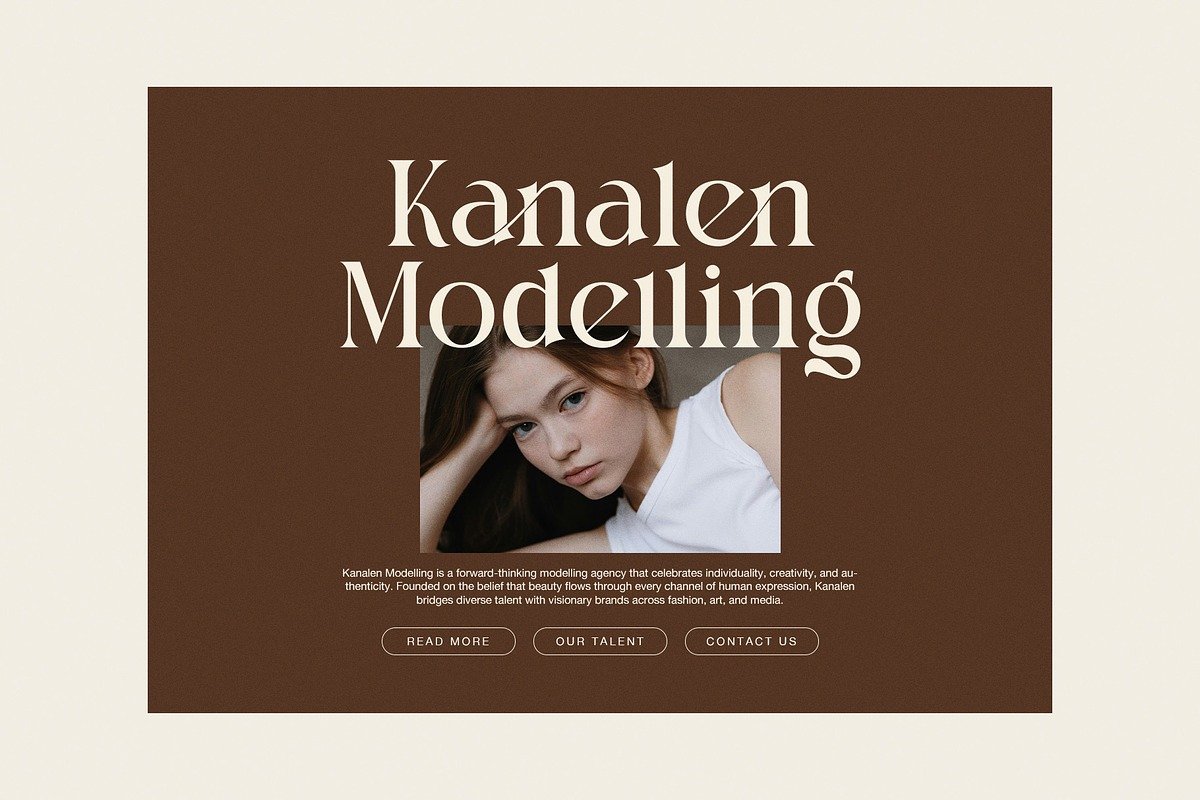
1. Branding and Logo Design
Molgin is an excellent choice for:
Fashion brands
Jewelry and beauty labels
High-end restaurants and hotels
Personal brands and portfolios
Its elegant serif structure conveys trust, quality, and sophistication—qualities often associated with premium brands.
2. Editorial and Publishing
Thanks to its readability and classical roots, Molgin works beautifully in:
Magazines
Books and novels
Editorial layouts
Blogs and long-form articles
When used for headlines or subheadings, Molgin adds authority and visual interest. When used for body text (at appropriate sizes), it creates a pleasant and engaging reading experience.
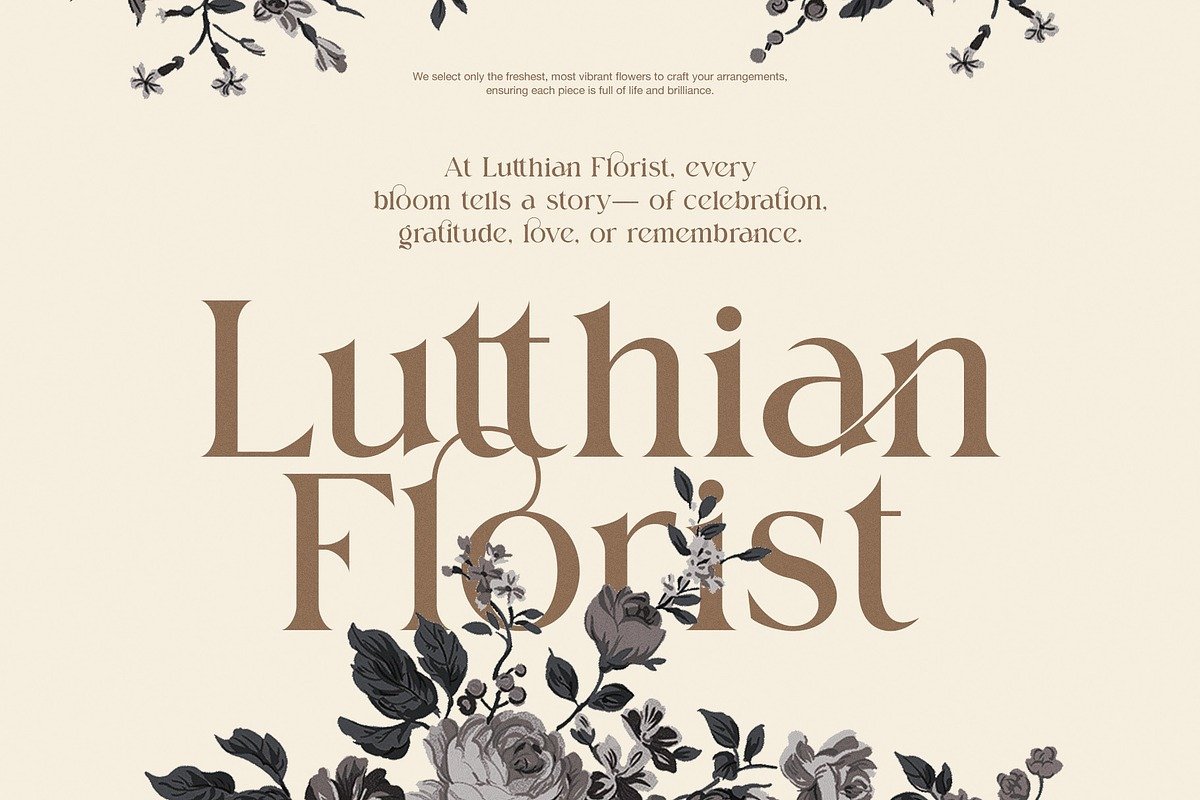
3. Wedding and Event Design
Molgin’s refined aesthetic makes it particularly suitable for:
Wedding invitations
Event programs
Greeting cards
Luxury stationery
Its elegant curves and classic feel pair wonderfully with minimalist layouts and soft color palettes.
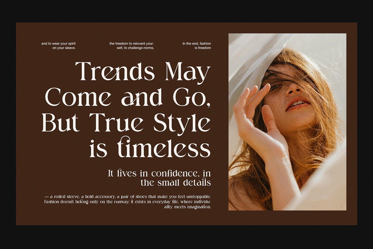
4. Digital Design and Web Typography
Despite being a serif font, Molgin adapts well to modern web design. When combined with a clean sans-serif font for body text, it creates a striking visual hierarchy for:
Website headers
Landing pages
Hero sections
Social media graphics
Pairing Molgin with Other Fonts
To maximize Molgin’s impact, thoughtful font pairing is essential. Because Molgin already has a strong personality, it pairs best with simpler typefaces.
Recommended pairings include:
Minimal sans-serif fonts for body text
Light-weight grotesque fonts for UI elements
Neutral humanist sans-serifs for balance
This contrast allows Molgin to shine as a headline or display font while maintaining overall readability and visual harmony.
Emotional Impact and Brand Perception
Typography plays a powerful psychological role in how audiences perceive a brand or message. Molgin communicates:
Elegance – through its refined serif details
Trust – via its traditional typographic structure
Creativity – with subtle stylistic flourishes
Professionalism – thanks to its balanced proportions
Because of this, Molgin is particularly effective in projects that aim to establish credibility while still feeling artistic and expressive.
Designers are often drawn to Molgin for several key reasons:
Timeless appeal: It does not follow short-lived design trends, making it suitable for long-term branding.
Creative flexibility: It works across print and digital formats.
Distinct personality: Molgin stands out without being overpowering.
High-quality craftsmanship: Attention to detail in letterforms and spacing reflects professional design standards.
These qualities make Molgin a dependable typeface for both seasoned designers and newcomers alike.
Best Practices for Using Molgin
To get the most out of Molgin Elegant Serif Font, consider the following tips:
Use it for headlines, logos, and titles where elegance matters most.
Avoid overcrowding—give the font enough white space to breathe.
Pair it with modern design elements for a contemporary look.
Experiment with font weights and sizes to create hierarchy.
When used thoughtfully, Molgin can transform simple layouts into visually compelling designs.
Conclusion
The Molgin Elegant Serif Font is a celebration of refined typography. By blending classical serif traditions with modern design sensibilities, it offers a versatile and timeless solution for a wide range of creative projects. Whether you are designing a luxury brand identity, crafting an editorial layout, or building a visually striking website, Molgin provides the elegance, clarity, and character needed to leave a lasting impression.
In a design landscape that constantly evolves, Molgin stands as a reminder that true elegance never goes out of style.