Peachy Retro – Modern Retro Serif emanates from Dharmas Studio, a creative outfit known for combining vintage typographic elements with polished, contemporary utility fonts. Released on November 9, 2023, this serif was conceived to celebrate the resurgence of tightly spaced, elegant typefaces from the 1980s and 1990s. The designer saw a trend—classic serif forms coming back into vogue—and responded with a typeface that balances nostalgia and modern design needs.
2. Aesthetic Identity and Visual Character
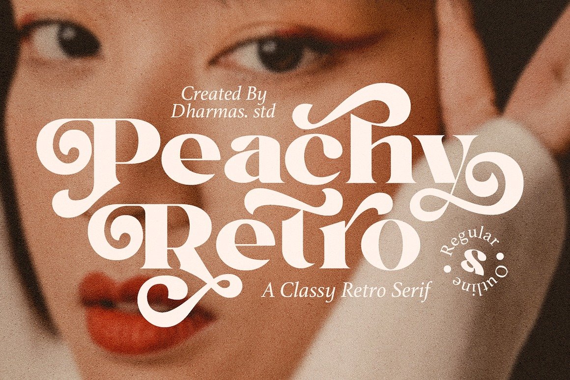
At first glance, Peachy Retro captivates with its warmly curved serifs and precise proportions, blending retro temperament with contemporary graphical sensibility. Its name—“Peachy”—suggests softness and friendly charm, which manifests in its smooth serif transitions and subtle outlines. The accompanying Outline version adds a decorative outline that heightens contrast and style when layered with the Regular.
With upper- and lowercase support and 191 special alternates, the font offers expressive flexibility to both small and large-scale design needs—making it equally valuable for display headlines and more reserved body text.
3. Technical Depth and File Accessibility
Included File Formats:
The font package encompasses TTF, OTF, WOFF, and WOFF2 files, ensuring compatibility across print, web, and editing platforms.
PUA Encoding & Glyph Access:
Peachy Retro is PUA-encoded, allowing designers to easily access all alternates and special glyphs in popular tools like Adobe Illustrator, Photoshop, Microsoft Word, Canva, and Cricut—without specialized software.
Alternate System:
With 191 special alternates, the font boasts an impressive collection of glyph variations. These enable subtle ornamental choices or bold stylistic tweaks, from small punctuation flourishes to complete letterform transformations.
4. Language Support and Versatility
Wide Linguistic Reach:
Peachy Retro supports numerous Latin-script languages including English, French, Spanish, German, Italian, Portuguese, Indonesian, and even regional languages like Nyankole, Oromo, Rambo, Gusii. This makes it globally usable, from European branding to Southeast Asian marketing and beyond.
5. Licensing & Access Tiers
Free for Personal Use:
A demo version is available for free personal use on platforms like Davonta, Be fonts, 1001FreeFonts, MyFontLib, etc.
Paid Licensing for Commercial Use:
For professional use, Dharmas Studio offers multiple licensing options via their official site:
License Type
Price (USD)
Desktop License
$18
Template License
$37
Webfont License (Unlimited)
$70
E-Pub License
$90
Social Media Creator License
$190
Trademark/Logo License
$290
Premium License (Recommended)
$370
Extended License
$490
App/Game/Servers License
$590
Broadcast/Movie License
$1,790
Corporate License
$2,390
This comprehensive licensing structure enables users to purchase exactly what they need—whether it’s a simple desktop project or a full-scale commercial campaign.
6. Applications & Practical Uses
Display and Branding:
The font’s retro-modern aesthetic makes it perfect for brand identities, logos, packaging, and posters that need nostalgic appeal with a refined edge.
Editorial and Digital Layouts:
Working well in both display and body text, especially when pairing Regular and Outline styles for headers or editorial highlights.
Social Media & Web Presence:
Ideal for eye-catching Instagram posts, headers, and web titles, where visual flair can help messages stand out.
Merchandise & Crafts:
Thanks to its PUA encoding and accessibility in Cricut, it’s great for crafts, apparel, stickers, or custom stationery.
Layered Design Effects:
Combining Regular and Outline in layering creates depth and stylized effects—great for dramatic headlines or layered typographic compositions.
7. Comparative Trend Insight
Reddit and font discussion forums note a broader resurgence of Peachy Retro – Modern Retro Serif. Designers are increasingly crafting serif fonts with tight spacing and bold character blends, akin to Peachy Retro.
One Reddit user described a similar concept—“Perfectly Nineties”—highlighting tight spacing and dual-style use (regular + italic) within the same word for contrastful impact.
Another example, Regards – Modern Retro Serif, offers alternate-letter styling and playful vintage elegance, demonstrating how these retro serif forms are trending across branding, packaging, and editorial fields.