Ragikon – Playful & Chunky Font: A Bold Expression of Fun and Creativity
In the ever-evolving world of typography, fonts are more than just tools for displaying text—they are powerful visual voices. Among the many styles available today, playful and chunky fonts have carved out a special place for designers who want to communicate energy, friendliness, and bold personality. One such standout is Ragikon, a playful and chunky font that effortlessly blends fun, creativity, and visual impact.
A First Impression That Pops
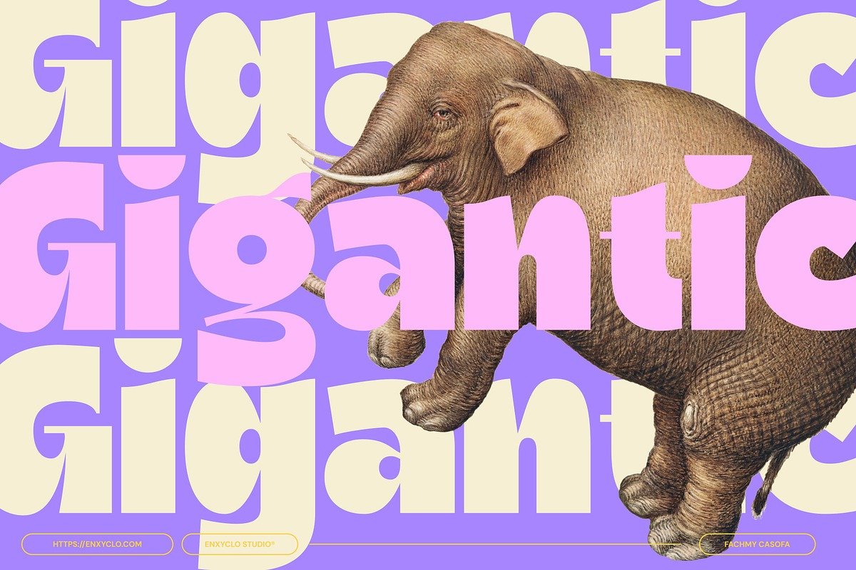
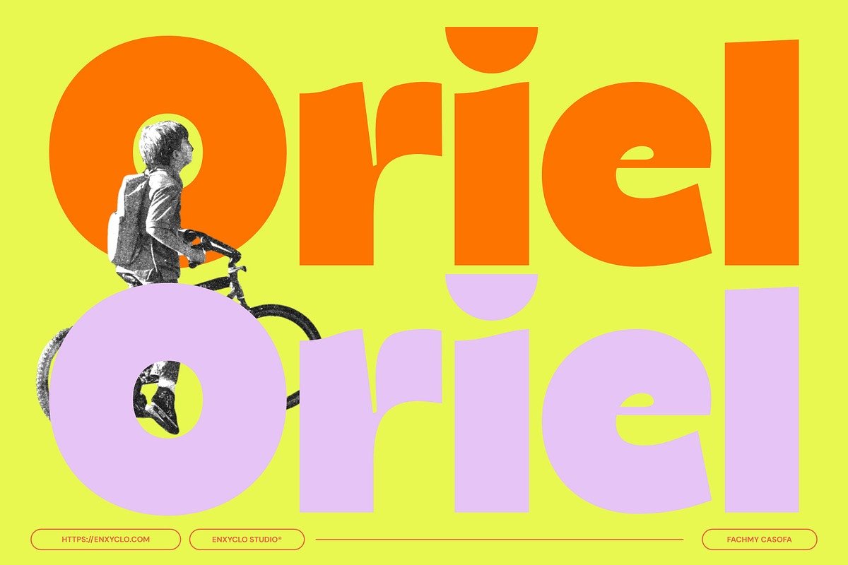
Ragikon immediately captures attention with its thick strokes, rounded edges, and lively character shapes. The font feels bold without being aggressive, cheerful without being childish, and expressive without losing readability. Its chunky letterforms create a strong visual presence, making it ideal for headlines, logos, and display text where first impressions matter most.
Unlike minimalist or ultra-thin fonts that can fade into the background, Ragikon confidently steps forward. Each letter feels handcrafted, giving the font a warm and approachable personality. This makes it especially appealing for brands and projects that aim to feel friendly, fun, and memorable.
The Playful Personality of Ragikon
What truly defines Ragikon is its playful nature. The font appears to dance across the page, thanks to its slightly irregular shapes and soft curves. This subtle imperfection gives it a human touch, making it feel organic rather than mechanical. It communicates joy, creativity, and imagination—qualities that resonate strongly in modern design trends.
Ragikon is perfect for projects that want to spark curiosity or evoke positive emotions. Whether used in children’s content, casual branding, or creative advertising, it brings a sense of fun that instantly connects with viewers. Its playful tone can lighten serious messages or amplify joyful ones, depending on how it’s applied.
Chunky Design with Purpose
The chunky construction of Ragikon isn’t just about aesthetics—it serves a practical purpose too. Thick letterforms ensure excellent legibility, even from a distance or at smaller sizes. This makes the font highly versatile across both digital and print platforms.
From posters and packaging to social media graphics and merchandise, Ragikon holds its shape and clarity. The weight of the font allows it to stand out against busy backgrounds, vibrant colors, or textured surfaces. Designers can confidently layer Ragikon over illustrations or photos without worrying about losing readability.
Versatility Across Creative Projects
One of Ragikon’s greatest strengths is its adaptability. While it shines in playful contexts, it can also be styled to suit a wide range of creative needs. Paired with bright colors, it feels energetic and youthful. Combined with pastel tones, it becomes cute and charming. When matched with neutral palettes, Ragikon can even take on a modern, stylish edge.
This versatility makes it an excellent choice for:
Brand logos and mascots
Posters and event flyers
Product packaging and labels
Children’s books and educational materials
Social media posts and digital ads
Stickers, apparel, and merchandise
Ragikon works particularly well as a display font, where its bold personality can shine without being overwhelming. When paired with a clean sans-serif or simple serif font for body text, it creates a balanced and visually appealing typographic hierarchy.
Enhancing Brand Identity
Typography plays a critical role in shaping brand identity, and Ragikon offers a strong foundation for brands that value creativity and approachability. Its playful and chunky style conveys confidence, friendliness, and originality—qualities that help brands stand out in crowded markets.
Startups, creative studios, food brands, toy companies, and entertainment projects can all benefit from Ragikon’s expressive charm. It helps establish a voice that feels welcoming and fun, encouraging audiences to engage and connect on an emotional level.
A Font That Sparks Creativity
Beyond its visual appeal, Ragikon inspires creativity. Designers often find that expressive fonts like this encourage more experimental layouts and bold design choices. Ragikon invites you to play—with spacing, color, composition, and scale. It’s the kind of font that doesn’t just support a design concept but actively enhances it.
Because of its strong character, Ragikon often becomes the centerpiece of a design. A single word set in Ragikon can communicate mood and message without additional elements, making it a powerful tool for visual storytelling.
Conclusion
Ragikon is more than just a playful and chunky font—it’s a celebration of bold expression and joyful design. With its thick, rounded letterforms and lively personality, it brings warmth, fun, and clarity to any creative project. Whether you’re building a brand, designing eye-catching graphics, or crafting engaging content, Ragikon offers a distinctive typographic voice that’s hard to ignore.
For designers seeking a font that balances readability with personality, structure with spontaneity, Ragikon is a standout choice. It reminds us that typography doesn’t have to be serious to be effective—sometimes, being bold, playful, and a little chunky is exactly what a design needs.