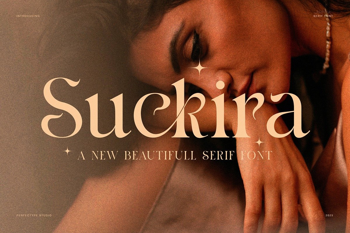
Suckira – A Modern Elegant Serif Font for Timeless Design
Typography is more than the arrangement of letters; it is the visual voice of a brand, a publication, or a creative idea. In a world where design trends constantly evolve, serif fonts continue to hold a unique position—balancing tradition, sophistication, and readability. Suckira, a modern elegant serif font, is a perfect example of how classic typographic principles can be reimagined for contemporary design needs.
Suckira is not just another serif typeface. It is a refined blend of elegance, modern aesthetics, and functional versatility. Designed with precision and artistic intent, Suckira brings a luxurious yet approachable feel to any project, making it ideal for designers who want to communicate clarity, confidence, and style.
The Concept Behind Suckira
Suckira was created with a clear vision: to merge modern minimalism with classic serif elegance. Traditional serif fonts often evoke history, literature, and formality, while modern design leans toward clean lines and simplicity. Suckira bridges these two worlds seamlessly.
The font features carefully sculpted serifs, balanced proportions, and smooth transitions between thick and thin strokes. This thoughtful construction allows Suckira to feel both timeless and current—equally at home in a high-end fashion magazine or a sleek digital brand identity.
At its core, Suckira is designed to elevate visual storytelling. Whether used for headlines, logos, or editorial layouts, it adds character without overpowering the content.
Elegant Design Characteristics
One of Suckira’s defining qualities is its elegant structure. The letterforms are crafted with attention to detail, ensuring that each character contributes to a cohesive visual rhythm.
Key design features include:
Refined Serifs The serifs are subtle yet expressive, providing a graceful finish to each letter without appearing heavy or outdated.
Balanced Contrast Suckira maintains a moderate contrast between thick and thin strokes, giving it a polished and luxurious appearance.
Clean Curves and Sharp Terminals Smooth curves paired with precise terminals create a sophisticated look that feels intentional and contemporary.
Well-Proportioned Letterforms Each glyph is designed for visual harmony, ensuring consistent spacing and excellent readability.
One of Suckira’s greatest strengths is its versatility. While it carries an elegant tone, it is not limited to formal or traditional projects. Instead, it adapts beautifully across a wide range of creative fields.
Ideal use cases include:
Editorial Design Magazines, journals, and newspapers benefit from Suckira’s readability and refined aesthetic, especially for headlines and subheadings.
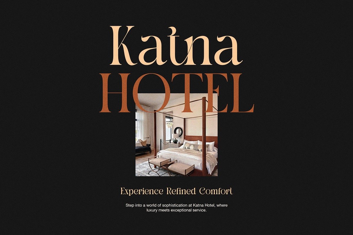
Branding and Logo Design Suckira is an excellent choice for brands that want to communicate luxury, trust, and professionalism.
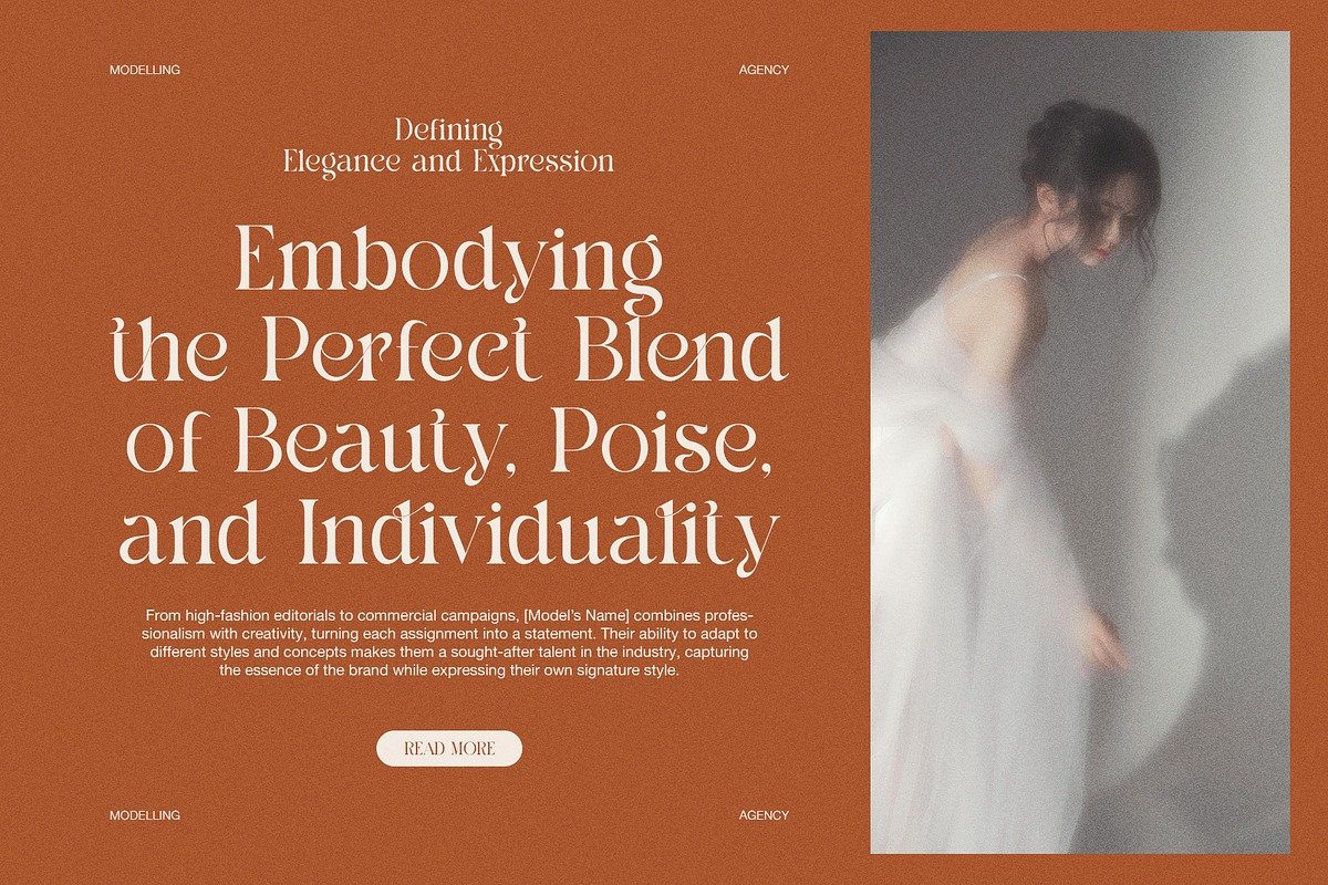
Fashion and Lifestyle Projects The font’s graceful appearance aligns perfectly with fashion lookbooks, beauty brands, and lifestyle blogs.
Web and Digital Design Its modern structure ensures clarity on screens, making it suitable for websites, landing pages, and social media graphics.
Print Materials From invitations to brochures and packaging, Suckira adds a premium feel to printed designs.
This flexibility allows designers to maintain visual consistency across multiple platforms using a single typeface.
Readability Meets Sophistication
Elegance in typography should never compromise readability. Suckira excels in this area by maintaining clear letter shapes and comfortable spacing. The font is designed to be legible even in longer blocks of text, making it suitable not only for decorative purposes but also for practical content.
The x-height and spacing are carefully balanced, allowing readers to move smoothly from one line to the next. This makes Suckira particularly effective for editorial layouts where aesthetics and readability must coexist.
Whether viewed on a large billboard or a mobile screen, Suckira remains clear, polished, and easy to read.
A Typeface That Enhances Brand Identity
Typography plays a crucial role in shaping brand perception. The right font can communicate values such as elegance, innovation, reliability, or creativity before a single word is read. Suckira’s modern serif design makes it a powerful tool for building a strong and memorable brand identity.
Brands that use Suckira often project:
Confidence and Authority
Refinement and Luxury
Modern Sensibility with Classic Roots
Because of its balanced personality, Suckira works well for both established brands and emerging startups seeking a sophisticated visual language.
Pairing Suckira with Other Fonts
Suckira pairs beautifully with a wide range of typefaces. For a balanced design system, it is often combined with clean sans-serif fonts. This contrast enhances visual hierarchy and creates a modern, editorial-style layout.
Popular pairing suggestions:
Sans-Serif Fonts for body text to complement Suckira’s elegance
Minimalist Grotesques for UI and navigation elements
Light Script Fonts for accent details in luxury branding
These combinations allow designers to create dynamic layouts while maintaining consistency and visual harmony.
Attention to Detail and Craftsmanship
Every curve, serif, and stroke in Suckira reflects careful craftsmanship. The font is designed with precision to ensure smooth performance across different platforms and file formats. This level of detail ensures that Suckira remains reliable for professional use.
Designers appreciate fonts that are not only beautiful but also technically sound. Suckira delivers on both fronts, offering a refined aesthetic supported by strong typographic foundations.
Why Choose Suckira?
With countless fonts available today, choosing the right one can be overwhelming. Suckira stands out because it offers a rare combination of elegance, modernity, and versatility.
Suckira is ideal if you are looking for:
A serif font that feels modern, not outdated
A typeface that works across print and digital media
A font that adds luxury and professionalism
A reliable choice for branding, editorial, and creative projects
It is a font that does not follow trends blindly but instead builds on timeless design principles, ensuring longevity in your creative work.
Conclusion
Suckira – Modern Elegant Serif Font is more than a typographic choice; it is a design statement. By blending classic serif sophistication with modern clarity, Suckira empowers designers to create visuals that are both beautiful and meaningful.
Its refined details, balanced proportions, and versatile applications make it a valuable addition to any designer’s font library. Whether you are crafting a brand identity, designing a magazine layout, or building a stylish website, Suckira offers the elegance and functionality needed to bring your vision to life.
In a design landscape that values both aesthetics and usability, Suckira stands as a timeless, modern serif font that truly delivers.