Boola Font: A Playful, Modern Typeface Designed for Expressive Visual Communication
Typography plays a major role in shaping the tone and personality of a design. Among the many creative typefaces gaining attention today, Boola Font stands out for its playful look, modern structure, and strong visual presence. Though it is not a mainstream, widely commercial typeface like Helvetica or Gotham, Boola has become increasingly popular among designers who want to infuse their work with a sense of fun, energy, and character. With its bold lines and whimsical curves, Boola Font brings a refreshing design approach that fits perfectly into contemporary visual trends.
Unique Aesthetic Features of Boola Font
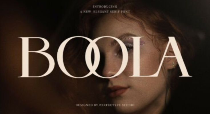
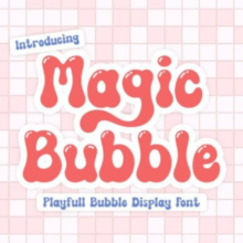
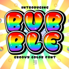
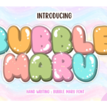
Boola is best described as a rounded, bold display font with a charming, cartoon-like feel. Its soft shapes and thick strokes create a friendly tone suitable for both professional and playful uses, depending on the context. The following features define Boola’s visual identity:
1. Rounded, Soft Edges
The smooth, circular edges give Boola its warm personality. Unlike sharp or angular fonts, Boola leans into a more inviting and youthful vibe, making it ideal for branding aimed at families, children, or casual settings.
2. Thick, Strong Letterforms
Boola’s bold weight ensures high visibility, making it perfect for display purposes such as headlines, logos, posters, and signage. The thickness also helps maintain legibility in colorful or complex layouts, where thinner fonts may get lost.
3. Subtle Quirks in Structure
While Boola is generally clean and simple, it includes small stylistic quirks—such as slightly exaggerated curves or extended strokes—that give it a handcrafted feel. These details provide designers with a typeface that feels both modern and distinct.
Why Designers Are Drawn to Boola Font
Designers often choose Boola because it blends functionality with charm. Its appeal lies in several practical and creative advantages:
A. Friendly and Approachable Personality
Brands that want to appear fun, warm, and inclusive benefit from Boola’s soft, playful look. Whether used on packaging or digital interfaces, the font instantly communicates approachability.
B. Excellent for Youth-Oriented Designs
Children’s books, educational materials, activity apps, and toy packaging all pair well with Boola. Its rounded forms mirror the visual style commonly used in kids’ media, making it an ideal choice for youthful themes.
C. Versatile in Modern Creative Trends
Bold, rounded typography is one of the strongest design trends in digital branding. Boola fits effortlessly into minimalist layouts, pastel color palettes, and flat illustration styles seen in contemporary marketing.
D. High Readability at Large Sizes
Because Boola is a display font, it shines at large scale. It retains clarity and charm on posters, signage, digital banners, and product labels—even at a distance.
Where Boola Font Works Best
Boola’s personality and structure make it ideal for a variety of creative applications. Some of the most common uses include:
1. Branding and Logo Design
Small businesses, cafés, bakeries, toy shops, and lifestyle brands often choose Boola for logos that need to express friendliness. Its bold curves make the brand name memorable and visually appealing.
2. Packaging and Labels
Food products, snacks, beverages, and children’s items look especially attractive when paired with playful typography. Boola works particularly well on colorful packaging that emphasizes fun and creativity.
3. Social Media Graphics
On platforms where eye-catching designs are essential, Boola’s bold shapes help content stand out instantly. It works well for announcements, quotes, promotional posts, and ads.
4. Posters and Events
From school events to community gatherings, Boola brings excitement and positivity to printed materials. Its strong presence ensures easy readability and enthusiastic design expression.
5. UI/UX for Fun-Focused Apps
Although Boola is not suitable for body text or detailed UI elements, it works beautifully for app splash screens, headers, and category labels in kids’ apps or lifestyle platforms.
Tips for Using Boola Font Effectively
Because Boola has such a strong personality, thoughtful usage ensures the best results:
-
Pair it with simple fonts. Neutral sans-serif fonts like Montserrat or Poppins balance its playful energy.
-
Use plenty of spacing. Rounded fonts look cleaner with slightly increased tracking.
-
Keep layouts minimal. Boola performs best when it has space to shine without clutter.
-
Reserve it for display roles. Headlines, logos, and large text blocks are ideal; avoid long paragraphs.
Conclusion
Boola Font combines boldness, softness, and creativity into a single expressive typeface. Its rounded shapes and cheerful personality bring a lively touch to branding, packaging, social media visuals, and youth-oriented designs. As modern design trends continue to celebrate approachable and character-driven typography, Boola is perfectly positioned as a fun, contemporary choice for designers looking to add warmth and charm to their visual communication.
