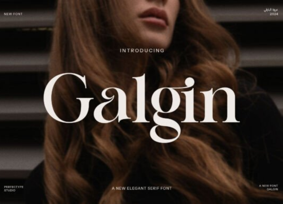
Galgin Font: A Bold, Modern Typeface for Contemporary Creative Expression
Typography is one of the most powerful storytelling tools available to designers. The right font not only makes text readable but also carries emotion, identity, and intention. In recent years, modern display typefaces have become increasingly popular as brands and creatives look for ways to stand out with expressive, high-impact visuals. Among these emerging favorites is the Galgin Font, a striking, contemporary typeface known for its bold geometry, clean lines, and confident presence. Built for designers who want to make unforgettable statements, the Galgin Font delivers a balance of strength and sophistication that sets it apart in the world of modern typography.
A Contemporary Typeface with Strong Visual Attitude
At its core, Galgin is a modern display font that emphasizes clarity and boldness. Unlike traditional serif or script typefaces, Galgin embraces minimalism through geometric forms, sharp angles, and uniform stroke weight. This stylistic approach gives the typeface a futuristic and highly polished aesthetic, perfect for branding, digital content, signage, and artistic compositions that aim to grab attention instantly.
Galgin’s visual identity is defined by its clean, almost architectural construction. Each letter is designed with precision, creating a cohesive and powerful silhouette. The font stands out for its ability to appear both rigid and fluid—rigid in structure, yet fluid in its adaptability to various design contexts. This duality makes Galgin ideal for designers seeking a font that feels modern without being overly decorative.
Signature Features That Define Galgin
Galgin carries several unique characteristics that give it a distinctive edge. These features not only contribute to its visual appeal but also enhance its usability across different design applications.
1. Strong Geometric Structure
At first glance, Galgin’s letters appear carved from solid shapes. Circles, squares, and triangles influence the overall construction, resulting in a font that feels engineered and intentional. This geometric form makes Galgin particularly effective in large display settings where clarity and impact are essential.
2. Even Stroke Weight
Consistency is key to Galgin’s strong visual rhythm. Its uniform stroke width creates a balanced, cohesive look that remains legible even at smaller sizes. This uniformity also contributes to the font’s modernist charm, reminiscent of mid-century design but with a fresh, contemporary twist.
3. Minimalist Yet Expressive Letterforms
While Galgin embraces simplicity, it doesn’t fall into monotony. Subtle touches—such as slightly angled terminals, softened corners, or unique proportions—add a sense of personality. These details elevate Galgin beyond a standard sans-serif, giving it a signature look.
4. Futuristic Aesthetic
Many creatives use Galgin when they want to channel technology, innovation, or forward-thinking design. Its sleek lines make it ideal for sci-fi themes, digital branding, and conceptual visuals that require a crisp, cutting-edge feel.
5. Versatile Use Across Media
One of Galgin’s strengths is its ability to adapt seamlessly from print to digital. Whether used on websites, posters, product packaging, logos, or social media graphics, the font maintains its clarity and bold energy.
Perfect for Branding and Visual Identity
Brand identity demands a typeface that reinforces the brand’s personality and tone. Galgin excels in this area, offering a clean yet assertive style that communicates confidence, modernity, and professionalism.
Companies and designers choose Galgin for branding projects in:
Technology and software development
Gaming and entertainment
Sports and outdoor equipment
Creative agencies and startups
Fashion brands with a futuristic or minimalist vibe
The font’s geometric firmness gives brands a stable, grounded feel, while its sleek design conveys innovation. When used in logos, Galgin creates strong visual anchors that are easy to recognize and memorable.
Impactful in Display and Editorial Use
Because of its bold appearance, Galgin shines in display-heavy environments. Posters, headlines, banners, and signage benefit from the sharp lines and intense presence of the font. The high legibility at large sizes ensures that the message is clear and captivating even from a distance.
In editorial contexts, Galgin works especially well for section titles, pull quotes, and graphic-driven spreads. When paired with a softer serif or a clean sans-serif body font, it creates strong visual contrast that enhances the overall layout.
A Strong Choice for Digital and Social Media Design
In the era of fast-paced digital consumption, fonts must work instantly and clearly. Galgin’s bold geometry captures attention within seconds, making it perfect for:
YouTube thumbnails
Instagram posts and ads
Website headers
User interface elements
App splash screens
Its contemporary style appeals to younger audiences and tech-savvy communities, making it a common choice for digital-first brands aiming for a sleek, progressive look.
Logo and Monogram Design Potential
Galgin’s strong geometry lends itself beautifully to minimalistic logos and monograms. Letters like G, A, N, and R have distinctive shapes that can be stylized even further to create unique logomarks. Designers often appreciate how Galgin’s angular precision allows them to experiment with spacing, letter stacking, and architectural forms to build identity systems that feel cohesive and iconic.
A monogram created with Galgin tends to appear bold, clean, and modern—qualities that work well for branding projects requiring simplicity with impact.
Beyond its aesthetics, Galgin is crafted to be highly functional. Many versions of the font include:
Clean vector outlines that render smoothly
Consistent kerning and spacing
Multiple weights or stylistic alternatives
Wide compatibility with major design software
This usability ensures that both beginners and seasoned designers can integrate Galgin into their projects with ease.
Why Galgin Stands Out in Modern Typography
What makes Galgin particularly compelling is its ability to feel both timeless and futuristic. It draws inspiration from classic geometric sans-serifs but updates the formula with sharper lines and modern proportions. This allows it to function as a versatile “bridge” font—one that suits minimalist branding as well as expressive display design.
Where some modern typefaces can appear too experimental or too rigid, Galgin offers the perfect middle ground. It is accessible, professional, and visually powerful without sacrificing personality.
Conclusion: A Modern Typeface with Lasting Appeal
The Galgin Font represents the best qualities of contemporary display typography: bold structure, clean geometry, and strong visual impact. Whether used in branding, digital design, editorial layouts, or logo creation, it delivers clarity and style in equal measure. Its minimalist yet expressive character makes it a go-to choice for creatives seeking a modern typeface that stands out without overwhelming the design.
With its confident lines and versatile applications, Galgin is more than a font—it’s a design statement that elevates every project it touches.