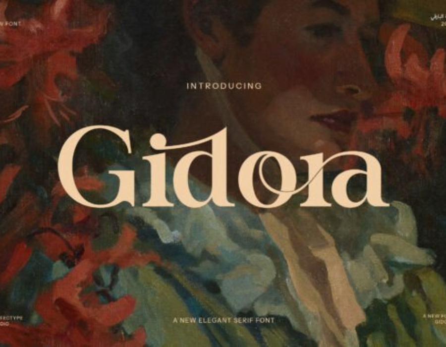
Gidora Font: A Modern Typeface for Bold, Expressive Design
Typography continues to play a defining role in visual communication, shaping how audiences perceive messages in digital and print media. Among the many typefaces emerging in contemporary design, the Gidora font has gained attention for its bold structure, geometric influence, and highly modern visual character. Whether used for branding, editorial layouts, posters, or digital interfaces, Gidora brings a distinctive edge to any project. This article explores the origins, characteristics, applications, and design strengths of the Gidora font while offering guidance for using it effectively.
Origins and Design Style
The Gidora font is a modern display typeface often described as geometric, wide-set, and slightly futuristic. Although the exact origin may vary depending on the version or designer who released it, Gidora is generally positioned in the same visual category as strong, modern sans-serif typefaces that prioritize clarity and visual impact. Designers often compare it to fonts like Eurostile, Bank Gothic, or certain extended-width tech fonts, though Gidora maintains its own unique identity.
Gidora’s design is built around clean lines, expanded letterforms, and a harmonized structure that gives every character a stable, grounded appearance. The generous spacing and extended proportions create a sense of openness, making the font especially suitable for headlines and visual statements. Its futuristic qualities also make it a favorite in tech-oriented branding and creative industries seeking a bold, contemporary look.
Key Characteristics of the Gidora Font
Gidora stands out because of several core design features:
1. Extended Geometry
One of the most distinctive aspects of Gidora is its wide or extended letter structure. Each character feels slightly stretched horizontally, creating a strong visual presence without sacrificing readability. This feature makes the font ideal for large displays, titles, and branding applications.
2. Bold, Modern Aesthetic
The font typically comes in bold or semi-bold weights that emphasize geometric blocks and consistent stroke widths. This modern aesthetic suits industries like technology, aerospace, gaming, architecture, and fashion—fields that often rely on sleek, futuristic design elements.
3. Clean Sans-Serif Construction
As a sans-serif typeface, Gidora avoids decorative strokes or serifs. Its minimalist yet commanding structure aligns well with modern design trends focused on simplicity, clarity, and sharp visual communication.
4. Futuristic Influence
Gidora’s shapes—particularly the flattened curves and angular edges—lend it a futuristic vibe. Designers frequently use it in sci-fi posters, tech startup branding, user interfaces, and conceptual digital designs.
5. Consistency and Balance
Despite its boldness, Gidora maintains visual balance across its character set. The symmetry and evenly distributed weights give the font a professional, refined look, avoiding the heaviness that often plagues extended-width typefaces.
When to Use the Gidora Font
Because of its strong visual identity, Gidora is best used in contexts where impact matters. Here are some ideal applications:
1. Branding & Logo Design
Many brands choose Gidora for logos because its geometry conveys stability, innovation, and confidence. Its wide form creates logo marks with a strong horizontal impression, ideal for tech companies, gaming brands, or fashion labels seeking a modern edge.
2. Headlines & Posters
Gidora excels in large sizes. Posters, magazine headlines, advertising materials, and event banners benefit from Gidora’s commanding, eye-catching presence.
3. UI/UX Design
While not always suitable for body text due to its extended width, Gidora works well for interface headings, menu titles, splash screens, and dashboard elements where modern minimalism is desired.
4. Product Packaging
The font’s futuristic quality makes it a popular choice for packaging in the tech, cosmetics, automobile, and gadget industries. It adds a premium, innovative aesthetic.
5. Motion Graphics & Video Titles
Gidora’s geometric stability and futuristic shape translate beautifully into kinetic typography and video intros.
Tips for Using Gidora Effectively
To maximize the impact of Gidora in design work, consider the following tips:
1. Pair It Carefully
Because Gidora is bold and extended, it should be paired with a simple, narrow, or neutral secondary typeface for body text. Good pairings might include a minimalist sans-serif like Inter, Roboto, Helvetica Neue, or a clean humanist font.
2. Use It Sparingly
Its strong personality means Gidora works best as a display typeface. Overusing it, especially in long paragraphs, may cause readability issues.
3. Balance White Space
Extended fonts need ample breathing room. Increase spacing around headlines or logos to maintain aesthetic clarity.
4. Match It With Modern Color Schemes
Gidora pairs well with monochromes, cool metallic tones, neon highlights, and minimalistic color palettes.
Why Designers Love the Gidora Font
Gidora has become a favorite among modern designers because it offers a perfect blend of impact, clarity, and futurism. It satisfies the need for a clean geometric typeface while standing out enough to give projects a memorable personality. Its boldness communicates strength, its geometry suggests innovation, and its overall structure works well in both digital and print media.
Conclusion
The Gidora font is more than just a typeface—it is a design statement. With its extended geometry, bold lines, and contemporary style, it allows designers to create visuals that feel modern, powerful, and unmistakably forward-thinking. Whether used in branding, posters, interfaces, or motion graphics, Gidora delivers a distinctive aesthetic that communicates confidence and sophistication. For designers seeking a typeface that stands out while remaining clean and professional, Gidora is an excellent choice.