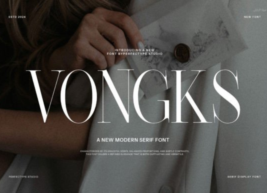
Vongks Font: A Bold New Direction in Modern Typography
Typography is far more than the selection of letters on a page; it is a deliberate art form that shapes meaning, emotion, and identity. In the design world, where fonts often determine how a message is perceived long before the reader interacts with the content itself, the choice of typeface is a powerful creative decision. Among the modern display fonts gaining recognition for their distinct flair and artistic personality, the Vongks font has carved out a unique place. Characterized by expressive geometry, playful strokes, and a sense of strong individuality, Vongks stands out as one of the most visually captivating typefaces for designers seeking originality and bold communication.
A Distinctive Visual Character
The Vongks font is often described as a modern display typeface with experimental roots, blending geometric precision with unconventional design elements. Unlike traditional serif or sans-serif categories, Vongks exists in a space of its own—an expressive fusion of sharp edges, rounded contours, unexpected line breaks, and stylistic curves. Its appearance is dynamic, almost kinetic, giving each character a sense of movement and emotion.
At first glance, Vongks may strike the viewer as artistic or even futuristic. Many of its letterforms include broken strokes, overlapping shapes, or exaggerated angles, which lend the font an avant-garde aesthetic. This makes Vongks particularly effective for projects that prioritize visual impact over subtlety. While it would not typically be used for long paragraphs of text, it excels in titles, logos, posters, album covers, product labels, and digital content that demands immediate attention.
Every typeface carries a philosophy, whether explicit or implied. The Vongks font’s design speaks to themes of creativity, experimentation, and confident individuality. It breaks away from the expectations of traditional typography by challenging symmetry and conventional readability. Yet it maintains enough structural consistency to be legible and functional.
The design philosophy of Vongks can be summarized in three words:
Unconventional – Vongks avoids the predictable linearity of common typefaces. Instead, it embraces creative distortions that make every letter feel like a statement.
Expressive – Its unusual shapes convey emotion and energy, echoing the contemporary push toward expressive, personality-rich branding.
Bold – Vongks commands attention, making it ideal for visual identity systems that aim to stand out in a crowded market.
In an era where minimalist fonts dominate corporate branding, Vongks represents a refreshing divergence—an emblem of creative rebellion against uniformity.
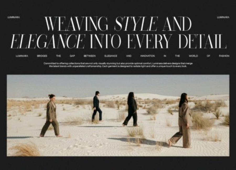
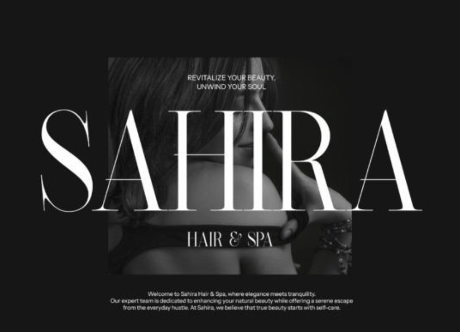
Applications in Branding and Visual Identity
The rise of indie brands, digital influencers, and small creative businesses has fueled demand for typefaces with memorable character. Vongks fits perfectly into this trend. Its unconventional form instantly differentiates any brand that uses it, making it an excellent choice for identity systems that seek to express originality, youthfulness, and confidence.
1. Creative Brands and Startups Brands in art, fashion, gaming, entertainment, and tech might find Vongks a perfect fit. Its futuristic and abstract qualities align well with companies that want to appear innovative or disruptive.
2. Streetwear and Lifestyle Labels The bold, edgy nature of Vongks pairs well with the aesthetics of modern streetwear brands, which often favor strong graphics and expressive typography.
3. Music and Entertainment Album covers, festival posters, and visual promotions for artists—especially in electronic, indie, or alternative genres—can benefit from Vongks’ dramatic presence.
4. Social Media Content Creation Influencers and content creators frequently use bold typography to catch viewers’ eyes in crowded feeds. Vongks’ strong personality helps posts stand out immediately.
Pairing Vongks with Complementary Fonts
Because Vongks is a display font, it is most effective when paired with a simpler, more neutral typeface for supporting text. Common choices include minimalist sans-serifs or soft serifs that contrast with Vongks’ visual intensity.
Some ideal pairings include:
Montserrat – A clean and modern sans-serif that balances Vongks’ eccentricity.
Poppins – Its geometric style complements Vongks’ shapes without overpowering them.
Cormorant Garamond – A high-contrast serif that adds elegance when paired with Vongks’ bold structure.
Inter – Perfect for digital interfaces and small text accompanying Vongks headlines.
When used carefully, these combinations create a hierarchy that is visually striking yet easy to read.
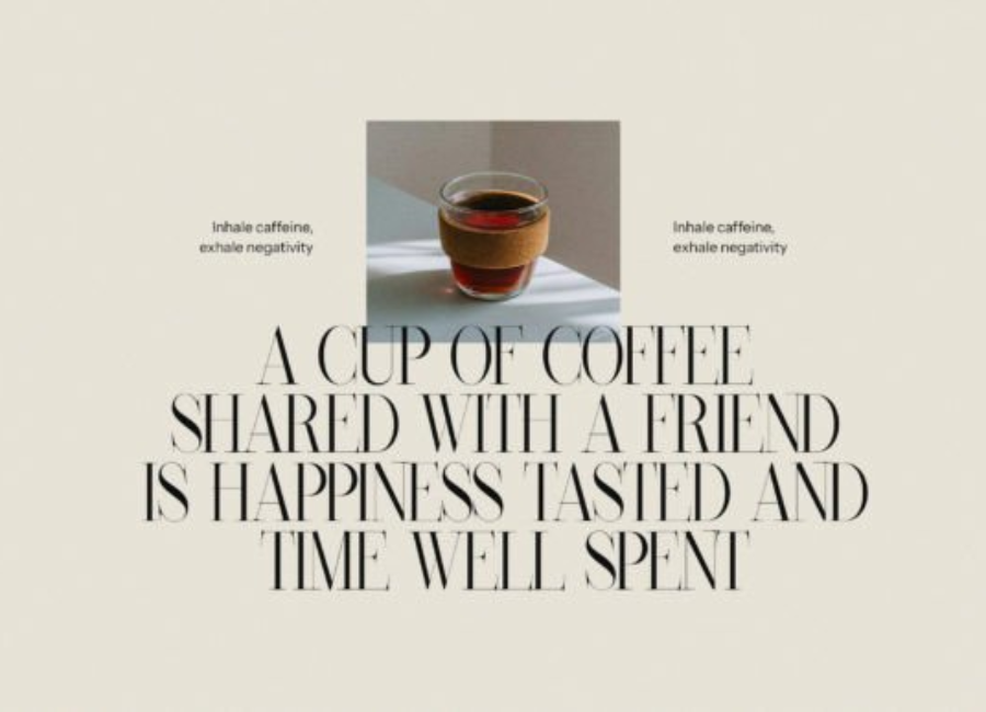
Vongks in Print and Digital Media
One reason the Vongks family has gained traction is its adaptability across media. Its clarity and striking forms make it effective both in print and on screens.
In Print: Vongks is often used for magazine spreads, editorial covers, business packaging, brochures, posters, and product labels. Its geometric structure ensures that even intricate shapes reproduce clearly in high-resolution printing.
In Digital: Online ads, website hero banners, app interfaces, and social-media graphics benefit greatly from its energetic shapes. Thanks to modern display technology, the font’s unique details remain clear even at moderate sizes.
However, designers must be mindful of size. Because some letterforms include breaks or exaggerated shapes, extremely small text may compromise legibility. For that reason, Vongks is best used at larger display sizes.
The Emotional Impact of the Vongks Font
Typography affects how people feel—an often underestimated psychological dimension of design. Vongks evokes a sense of:
Creativity – Its artistic shapes reveal a willingness to experiment and push boundaries.
Confidence – The boldness of its structure suggests a strong, assertive identity.
Modernity – Its futuristic aesthetic resonates with contemporary design trends.
Individualism – Vongks feels personal and human-made, appealing to brands and creators who value authenticity.
When used well, it can transform a simple message into a memorable visual statement.
Why Designers Are Drawn to Vongks
The growing popularity of the Vongks font in design communities can be attributed to several factors:
It stands out in an oversaturated world of minimalist typefaces.
Its unique style appeals to visual experimentation and artistic exploration.
It fits the current trend of expressive typography in digital marketing.
It offers designers a way to create memorable brand identities with minimal effort.
As more people embrace bold typography, Vongks is positioned to become a staple in creative industries.
Conclusion
The Vongks font represents more than just an artistic display typeface—it reflects a shift in modern design toward expressive, personality-driven visual communication. With its unconventional shapes, dynamic lines, and strong individuality, Vongks empowers designers to break away from traditional norms and create bold, captivating work.
Whether used for branding, posters, social media, or creative projects, Vongks offers a refreshing alternative to the uniformity of mainstream typography. In a world where standing out is more important than ever, Vongks delivers exactly the kind of visual impact designers seek: memorable, distinctive, and unapologetically original.