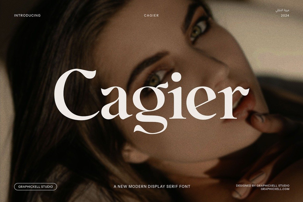
Cagier – The Elegant Display Font That Redefines Sophistication
Typography is one of the most powerful tools in visual communication. A well-chosen typeface doesn’t just present text — it conveys character, sets tone, and creates emotional resonance. Among the many typefaces available today, a font that has been steadily gaining attention for its refined aesthetic and timeless appeal is Cagier – Elegant Display Font. Blending vintage charm with contemporary design sensibilities, Cagier stands out as a versatile serif display font ideal for branding, editorial work, luxury packaging, and creative projects of all kinds.
1. What Is Cagier?
At its core, Cagier is a display serif typeface crafted to evoke sophistication and elegance. The term “display font” itself refers to typefaces designed to attract attention at large sizes — such as in headlines, logos, posters, or magazine covers — rather than for long bodies of text. Cagier fits this role beautifully: its high-contrast strokes and carefully refined serifs give it visual authority while still retaining readability and grace.
Display fonts like Cagier are not meant to be generic or invisible; they are designed to make a statement. Where a generic body text font disappears into the background, a display font becomes part of the visual identity itself, shaping how the viewer perceives a brand or design. In this sense, Cagier is more than a functional typeface — it’s an expressive tool that carries tone and personality.
2. Key Aesthetic Qualities
a. Elegant and Refined Letterforms
One of the first things that strikes designers about Cagier is its sense of refinement. The font’s letterforms exhibit precise proportions and graceful curves, balancing classic serif influences with a fresh, modern feeling. This dual character — both timeless and contemporary — is what makes the font particularly compelling for a wide range of projects.
b. Strong Visual Presence
Cagier’s design includes high-contrast strokes — thick vertical stems coupled with slender, tapered serifs. This contrast heightens visibility and helps key text elements stand out on the page or screen. When used at larger sizes, the font commands attention without feeling heavy or overbearing.
c. Vintage Meets Modern
While fundamentally a modern creation, the font nods to classic serif traditions. This gives it a subtle vintage allure — a design heritage that recalls the sophisticated typography of printed books and editorial layouts from earlier eras, yet updated for today’s aesthetic contexts.
3. Technical Features and Support
Cagier doesn’t just shine in its appearance — it also offers practical design support that makes it a versatile tool for creatives:
Multiple file formats: Typically available in OTF, TTF, and WOFF formats to ensure compatibility across platforms and devices.
Character standards and punctuation: Includes a full set of numerals, punctuation, and accented characters for extensive language support.
Multilingual capability: Supports Western European languages, allowing designers to work on international branding and communications.
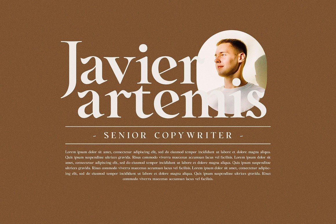
Professional design features: Many versions include alternates, ligatures, stylistic sets, and swashes — all of which give designers creative freedom to add stylistic tweaks and custom flourishes.
These features make Cagier not just beautiful, but usable. Whether you’re prepping print layouts or crafting digital interfaces, the font’s technical breadth ensures it performs well in various creative ecosystems.
4. Common Use Cases
a. Branding and Logos
Cagier’s strong visual character makes it a natural fit for branding. Logos that leverage this font tend to communicate luxury, quality, and refinement. Whether for a high-end fashion label, boutique café, or premium service brand, Cagier provides a distinctive personality that helps brands stand apart.
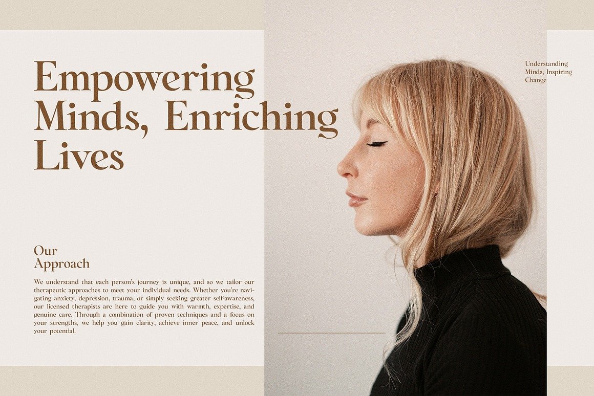
b. Editorial and Print Design
Magazines, book covers, and editorial spreads benefit from a typeface that balances readability with aesthetic impact. Cagier does both — offering eye-catching headings and chapter titles while keeping textual elements clear and legible. Its vintage-inspired qualities are particularly well-suited to editorial contexts that seek to evoke tradition and prestige.
c. Packaging and Product Design
In premium product categories — such as gourmet foods, perfumes, artisanal goods, or luxury spirits — typography plays a crucial role in signaling quality. A refined serif font like Cagier discreetly communicates craftsmanship and exclusivity, elevating the perceived value of the product.
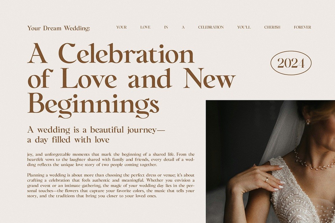
d. Invitations, Posters, and Advertising
From wedding invitations to event posters, any design that benefits from an elegant touch can take advantage of Cagier’s stylistic strengths. The font’s swashes and stylistic alternates allow designers to tailor the look to fit formal, celebratory, or editorial needs.
5. Comparisons With Other Serif Fonts
While Cagier embodies many qualities common to serif fonts, it differs from typical text-oriented serifs in some important ways:
Versus Traditional Text Serifs: Fonts like Times New Roman or Georgia are designed primarily for extended reading. They have moderate contrast and straightforward shapes for continuous body text. Cagier, by contrast, emphasizes aesthetic flair and is optimized for display roles, not long paragraphs.
Versus Modern Serif Display Fonts: Compared to ultra-decorative or experimental serif displays, Cagier retains a measured elegance. It doesn’t push the dramatic extremes of high fashion or avant-garde typography, which makes it more adaptable and balanced for a wide variety of audiences.
In this balance — classic yet contemporary, distinctive yet restrained — Cagier finds a sweet spot that allows it to feel both specialized and versatile.
6. Licensing and Usage Rights
One important aspect of using any font in professional design is understanding its license. Many online sources describe versions of Cagier that are free for personal use only, with commercial licenses available for purchase from authorized distributors. This distinction is crucial: using a typeface beyond its licensing terms can lead to legal issues or restricted usage in commercial products.
For designers planning to use Cagier in branding, product packaging, or professional client work, ensuring the correct commercial license is purchased is a best practice. Most distributors provide clear licensing terms and options for desktop, web, and app usage.
7. How to Use Cagier Effectively
A beautiful font is only as strong as the context in which it’s used. Here are some design strategies to get the most out of Cagier:
a. Pairing With Complementary Fonts
Because Cagier is a display typeface with significant visual weight, pairing it with a neutral sans-serif for body text can create balance. Styles like simple geometric or humanist sans serifs often work well, allowing the headline font to shine without competing for attention.
b. Letting Typography Lead the Design
In branding and poster design, letting Cagier carry the aesthetic — rather than layering heavy graphics — can make the design feel more elegant and curated. Minimalism paired with expressive typography often yields striking results.
c. Respecting White Space
Display fonts often need breathing room. Generous line spacing, padding around text, and thoughtful layouts help ensure that Cagier’s refined shapes are appreciated rather than crowded.
8. Conclusion
The Cagier Elegant Display Font is a testament to the power of thoughtful type design. With its refined curves, classic influences, and modern versatility, it offers designers a powerful tool to elevate projects with a sense of sophistication and visual authority. Whether for luxury branding, editorial spreads, product packaging, or event promotions, Cagier communicates elegance in every stroke.
In a world saturated with default typefaces and generic typography, choosing a well-crafted display font like Cagier can make all the difference — transforming content from mundane to memorable and ensuring your message resonates with style.